Standout Features:
- Natural texture with strategic color accents
- Balanced typography
- Subtle brand narrative details
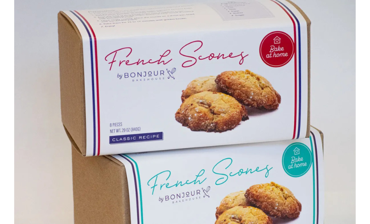
Bonjour Bakehouse, an artisan French bakery and café in California, offers a taste of France blended with local innovation. For their "Bake at home French Scones," Studio Contreras designed packaging that feels artisanal and high-quality while being informative and inviting for customers preparing the scones at home.
The packaging uses a natural craft paper box structure contrasted with clean white panels where key product information resides. Thin colored border lines in red, teal, and blue frame these panels, serving as a visual cue for different scone flavors. This use of color referencing the brand’s Frenchheritage makes for a very handcrafted feel.
Clarity is paramount — especially for a product requiring home preparation. While an elegant script font highlights the "French Scones" name, a clean sans-serif font helps make the product more readable by delivering the product info and instructions. The clear, numbered baking instructions on the side panel ensure proper usage too.
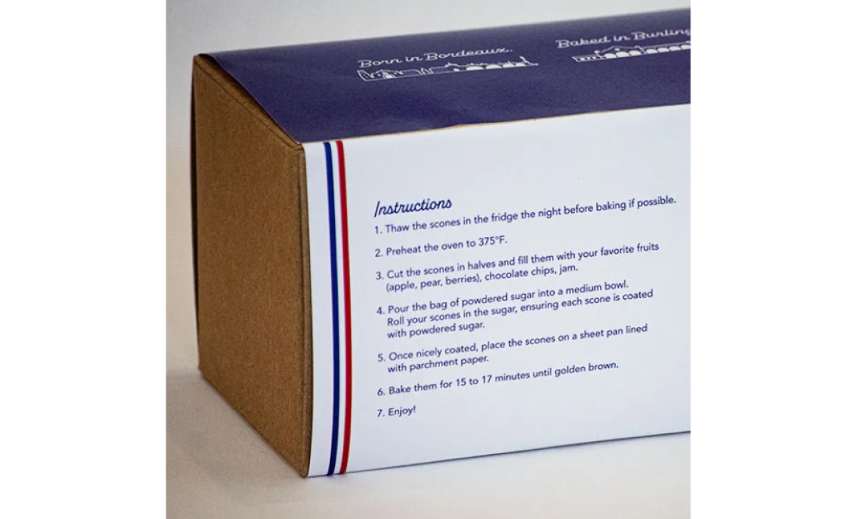
Beyond function, the packaging weaves in the Bonjour Bakehouse narrative. This story is reinforced on the top flap with the tagline "Born in Bordeaux. Baked in Burling...," directly linking the bakery's French roots with its California location. These details work together to communicate the brand's roots and give it that foreign-yet-local feel.
The key takeaway here is that packaging can be both beautiful and functional. As Studio Contreras proves, a good food packaging design should effectively communicate product quality and brand identity right from the shelf.