Standout Features:
- Vertical bag architecture with an integrated handle design
- Color-coded variants for clear product differentiation
- Photographic focus on ingredients for local authenticity
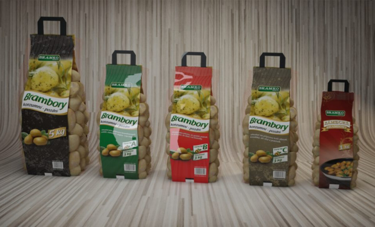
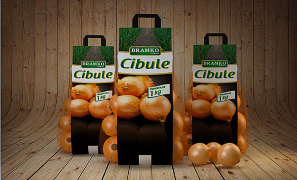
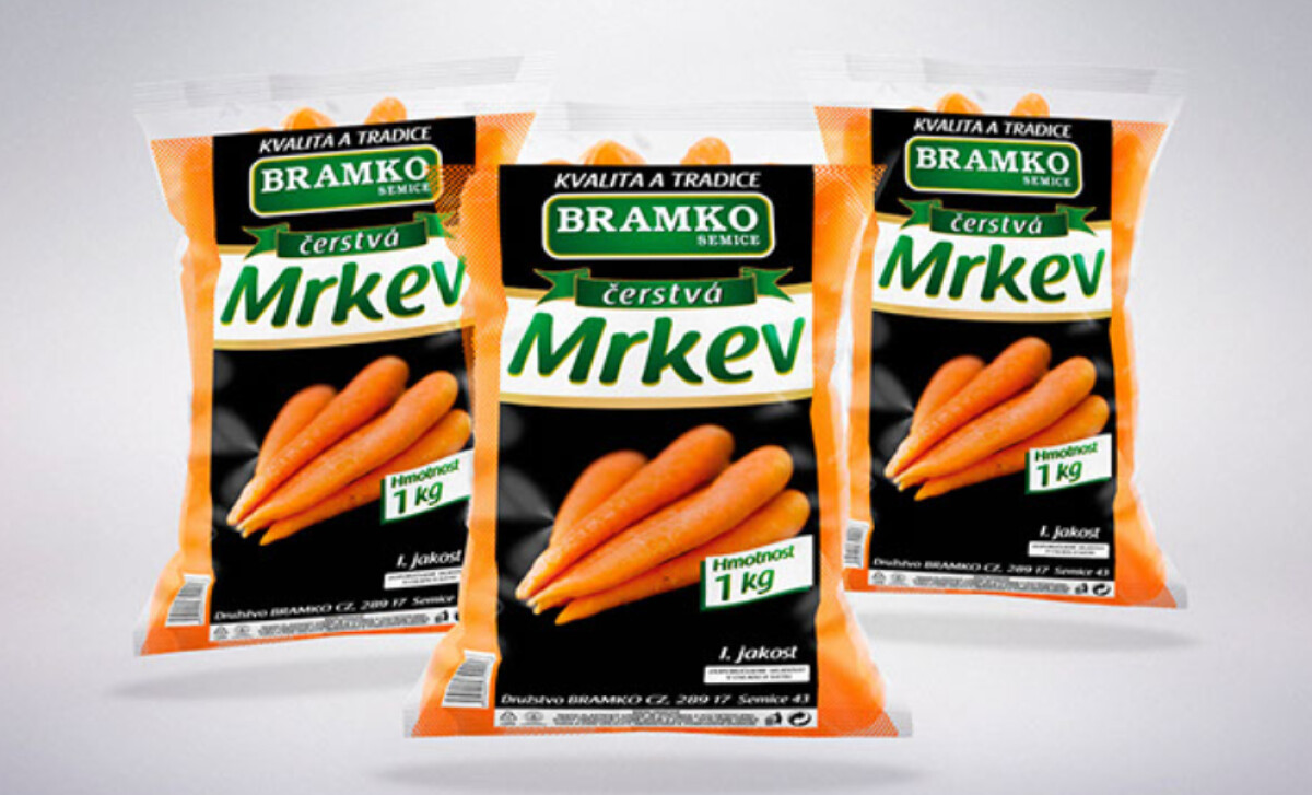
DHMO's packaging for Bramko is a study in functional brand consistency. The visual system for their produce — potatoes, onions, carrots — maintains a recognizable identity across all items. At the same time, it uses bold, structured design elements to highlight product differences.
Each bag features a distinct vertical architecture, with netted side panels allow the product’s natural texture and color to show through. This packaging innovation is a departure from rudimentary mesh sacks, ensuring the product face remains visible in retail settings.
By literally showing the product, the design embraces transparency — a crucial factor for building brand loyalty, which an overwhelming 94% of consumers say is important to them.
The food packaging design uses distinct color-coding for each product. For example, the 5 kilogram potatoes use black, while the smallest pack comes in red. This allows consumers to confidently identify and select their preferred item at a glance.
DHMO employs realistic, high-quality product photography rather than illustrations, often showing potatoes, onions, or carrots in clusters or stylized cooking settings. This is paired with texture-rich background images like soil or fields, reinforcing the brand's commitment to authenticity.
By improving the user experience at a practical level, Bramko showcases that functional innovation, such as the vertical bag architecture with an integrated handle, can be a key brand differentiator in a commodity market.

-preview.jpg)