Standout Features:
- Detailed illustrations depicting local Bydgoszcz heritage
- Prominent use of natural kraft paper textures
- Cohesive traditional and historical aesthetic
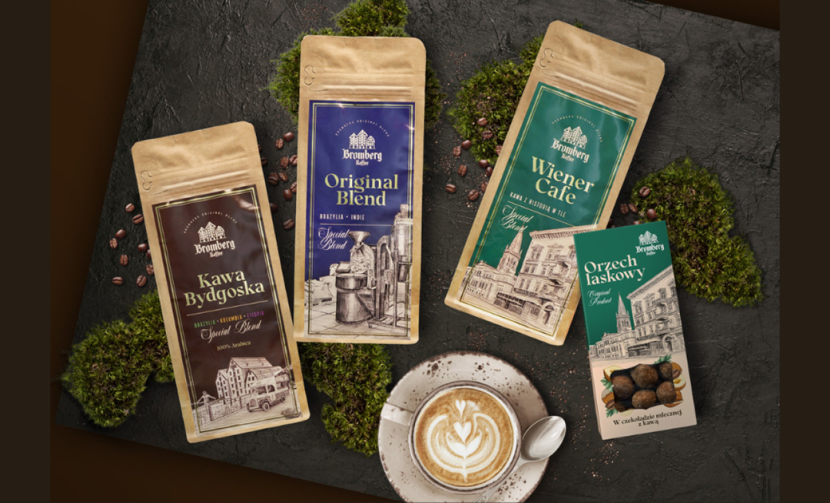
One way to design packaging for a coffee brand so it feels genuinely artisanal without resorting to overused coffee design elements is to do what Mion.studio did here. Its approach for Bromberg Kaffee involved using intricate, engraving-style illustrations that show local landmarks or scenes to build a truly authentic, heritage-rich packaging system.
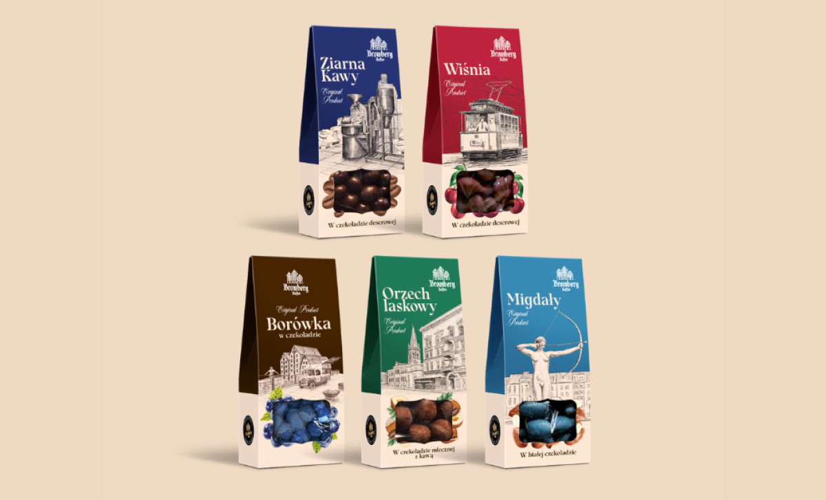
The intricate line drawings seen in this packaging is its defining characteristic. These illustrations, styled like classic engravings, show local Bydgoszcz architecture and cultural elements, bringing the brand's local pride to its design. Doing so makes the products feel deeply rooted in something important and communicates a quality only found here.
The intricate illustrations pair nicely with the brown kraft paper texture used across items. Used also for bags and on pouches, this material brings out a handcrafted, artisanal quality. It offers an earthy balance to the detailed drawings, and the natural feel reinforces the brand's connection to local production well.
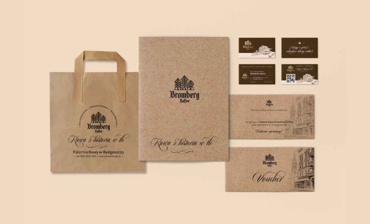
The whole visual system sticks consistently to a cohesive traditional aesthetic overall. You see this clearly reflected in the engraving-style illustrations, the frequent use of classic serif and calligraphic script typefaces, and that integral kraft paper integration. Then there's a heraldic logo mark that also anchors this traditional style nicely.
Connecting a product conceptually to a specific place or its unique origin story, achieved here through localized illustrations, adds compelling layers of authenticity and character. Such a beverage packaging system speaks to the hearts of consumers actively seeking products with genuine roots, provenance, and a story to tell.