Johnnie Walker Whiskey. Limited edition. Gorgeous.
The best package designs are turbocharged on visual eye candy to devour consumer attention like a black hole devours stars. This is a packaging design that looks like it could be placed in a modern art museum.
MW Luxury Packaging hit this one out of the park, across the city, over the county, and into orbit. This package design was part of Diageo’s 2017 Artist Series and I think I know why they look jaw-dropping. They were designed by world-renowned street artist Tristan Eaton. Glory be to Tristan. An artist, indeed.

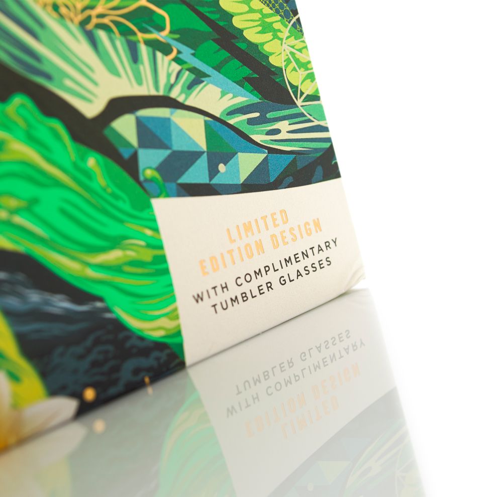
The boxes continue their stunning visual flair when opened up on the inside flap. On the right side sits two glasses and a bottle of Jonnie Walker is nestled on the left. High-end folks call these glasses “tumblers.” I like that.
The materials used in package design are of the utmost importance. Tristan chose a high-quality and rigid board. He did not stop there. He wrapped them in a premium pearl stock paper that shimmers in the light.

How did Tristan get the inspiration for this beauty? We must examine the Jonnie Walker company itself. Green Label has a depth of flavor deeper than the Mariana Trench. It’s blended.
This stuff is aged for 15 years. They blend four mature malt whiskeys which give off hints of cut grass, smoked wood, vanilla, and fresh fruit. Tristan was inspired by the landscapes and people of the great country of Scotland. He played with different shades and textures of green.
What is found in Scotland? Awesomeness. But also, sights of mysticism. They have the northern lights, and gorgeous wildlife, peaceful streams filled with wild trout, and flora that belongs in a picture book.
Flashes of green and gold foil are found throughout the glamorous design seen in the picture above. Look at Tristan’s level of detail. This is the level of detail we should all aspire to. There are so many textures and patterns but it is not overbearing. It blends in. It is mystical. Like a portal to a new fractal world of flavor.
This clean package design is clear in its communication. This is authentic. It is straightforward and clear.
Customers do not want to guess or be bamboozled. They want to know what is inside. Tristan executed this and it can be summed up in one word: Flawless.
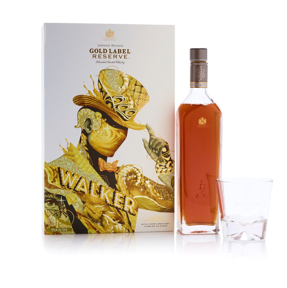
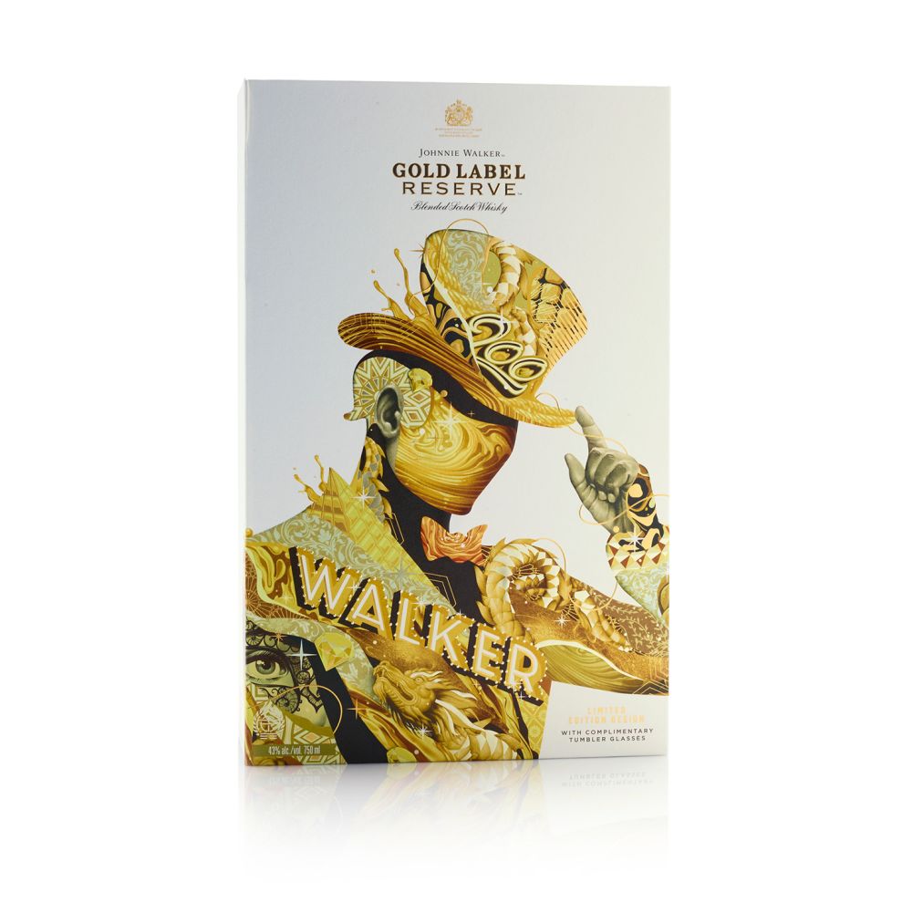
Enter Jonnie Walker Gold Label Reserve. Step into the world where King Midas has a hand in taste. This is the staple of the Colours Range. Tristan’s inspiration reflects the idea that Jonnie Walker Gold Label Reserve is all about the great times with great people.
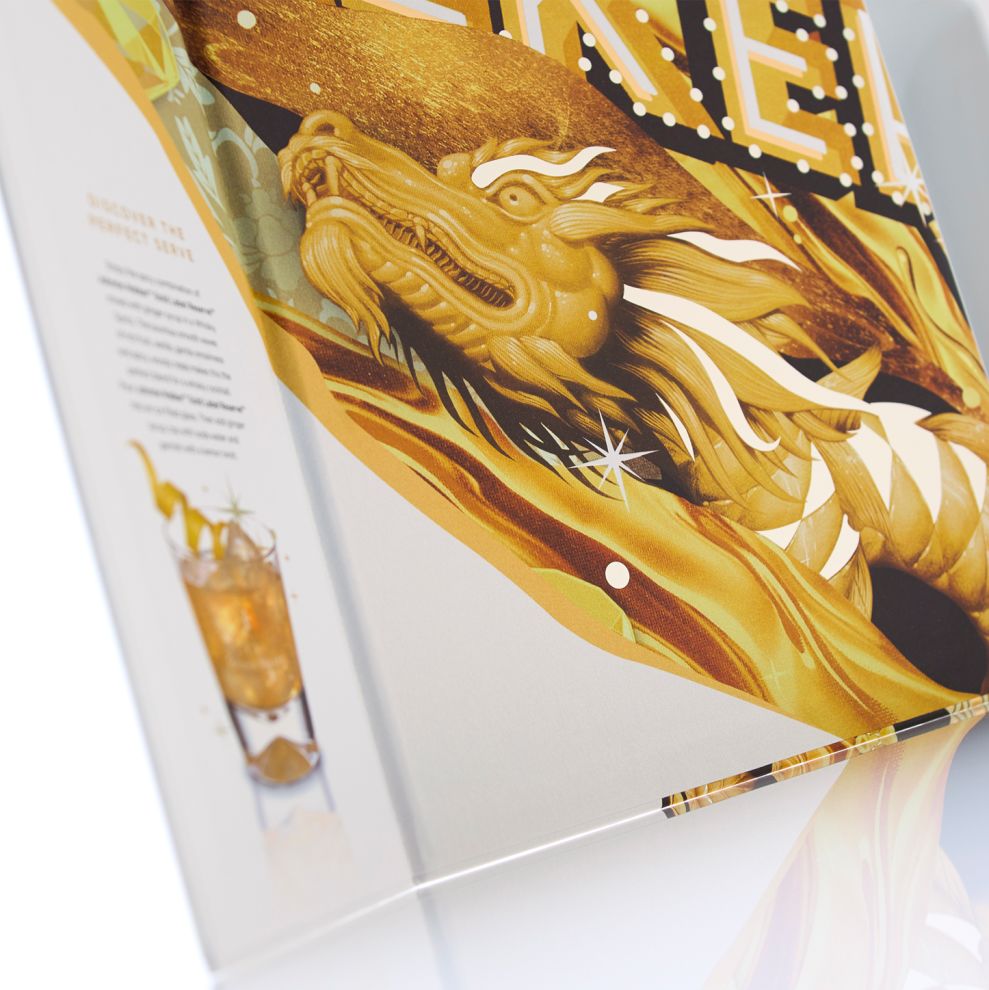
We have gold foil and a gold dragon, portrayed in a fierce illustration.
This dragon is stunning. The white and gold color contrasting adds a visual nirvana saved for those that reach enlightenment.
What do I think about the Jonnie Walker Limited Edition Whiskey by Tristan? They are jaw-dropping and reimagine an icon in luxurious gold and silver hues.
Johnnie Walker Limited Edition Whiskey is featured in the Food & Beverage category of the Best Package Design section.
Johnnie Walker Limited Edition Whiskey is an exciting package design in the Food & Beverage industry.