Standout Features:
- Smooth gradient pattern
- Playful rounded and classic sans-serif typography
- Underlined “0 calories” mark
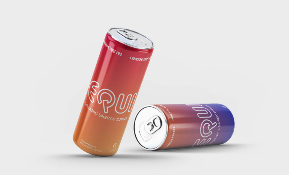
EQUI’s packaging design for organic energy drinks features vibrant gradients, legible typography, and beautifully presented information, all designed to communicate freshness and healthy living.
Abhi Balyan placed a smooth gradient pattern crafted with an array of vibrant colors at the heart of the packaging. This element instantly brings a sense of joy, excitement, and refreshment to the package, attracting consumers looking for a revitalizing beverage option.
The design incorporates two strategically placed typographies. First is the playful, rounded sans-serif typeface, like the one used in the logo. Its letters are curved and have extended lines, bringing a dynamic feel to the packaging and reinforcing the fun mood of the gradient colors.
The second font style, the classic sans-serif typography, contrasts this playful image. It conveys important information about the organic origin of the ingredients, aiding consumers in understanding the product and convincing them of its benefits.
Another significant design element is the underlined "0 calories" label at the bottom of the packaging. This mark highlights the brand's commitment to providing an organic beverage and a healthy, sugar-free option.

-preview.jpg)