Standout Features:
- Bold, vibrant color scheme
- Playful pet-inspired illustration
- Clever use of negative space
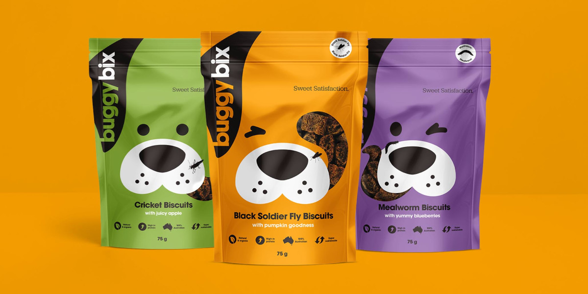
Buggy Bix is an Australian pet treat brand revolutionizing the industry with its insect-based biscuits, a sustainable and nutritious alternative for dogs. To match its bold mission, Percept developed a packaging design that is eye-catching, playful, and unmistakably pet-friendly.
Each product variant has a distinct hue — green for cricket biscuits, orange for black soldier fly biscuits, and purple for mealworm biscuits — creating strong shelf presence while ensuring easy product differentiation. The colors are energetic yet balanced, reflecting both the natural ingredients and the fun-loving spirit of pets.
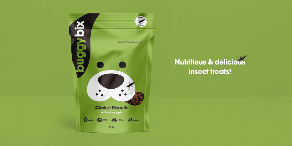
A playful illustration of a dog’s face dominates the packaging. The clever use of negative space allows the product window to blend seamlessly into the design, mimicking the dog’s mouth while giving pet owners a peek at the treats inside. Adding an extra layer of charm, tiny insect illustrations interact with the design, reinforcing the unique protein source in a lighthearted way.
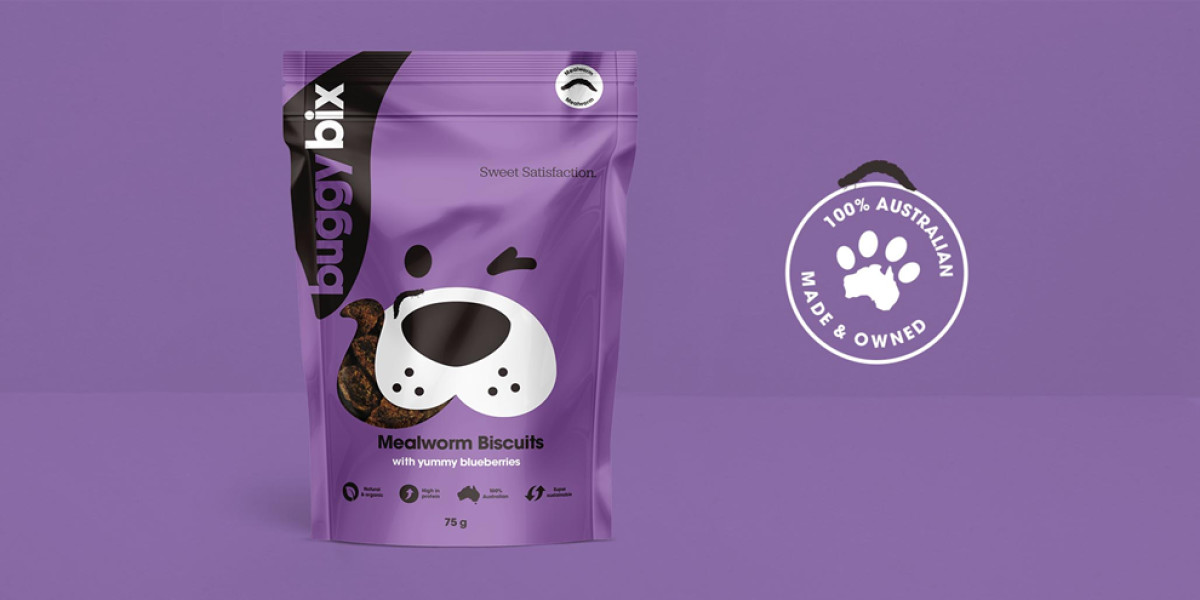
Typography remains clean and modern, complementing the contemporary branding without overwhelming the visuals. Combined with well-placed icons that highlight the product’s benefits — high protein, sustainable, and 100% Australian-made — the design effectively communicates Buggy Bix’s eco-conscious mission.
Percept’s design makes Buggy Bix stand out in the pet food packaging design space, balancing sustainability with a sense of fun, ultimately appealing to conscious pet owners looking for innovative and nutritious treats.

-preview.jpg)