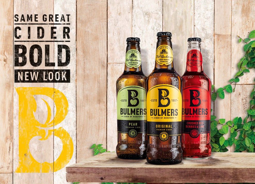
As alcoholic cider drinks gain in popularity within the U.S., companies need to push the envelope to be noticed. Bulmers Cider certainly achieves that. It successfully modernized its black bottle, yellow label, and traditional tone across multiple brand channels.

This modern approach adds a splash of color -- one for each new flavor. Their new logo has a large “B” icon with an apple and a leaf inside the negative space of the “B.” Even the typeface used for the Bulmers's name has been modified and updated for a new audience.

Meanwhile, subtle touches -- like adding in the ESTD. 1887 -- remind consumers that this is, in fact, the same cider they are accustomed to drinking. On the top of the bottle, a bicycle illustration gives a simple nod to the original cider-making pioneers, Fred and Percy.
Overall, the bold colors and and vibrancy of the package will ultimately attract attention on the shelf. The modern, authentic packaging is fun and full of flair.
Bulmers is an eye-catching packaging design in the Food & Beverage industry.


-preview.jpg)