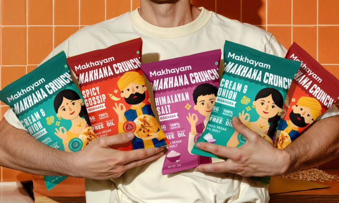
Standout Features:
- Whimsical globe-grape illustration
- Elegant cursive typography
- Minimalist layout with premium accents
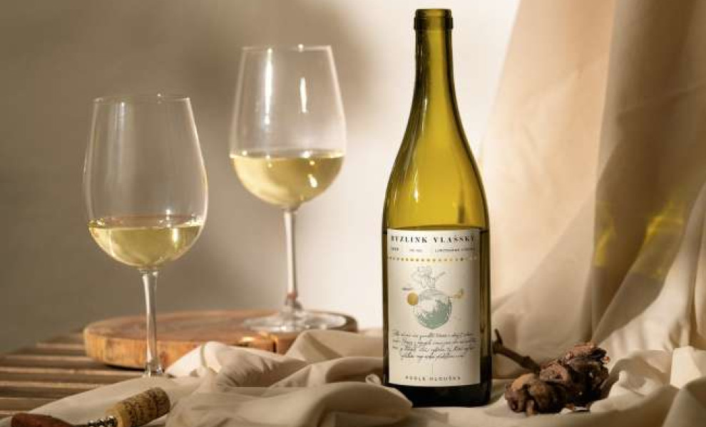
Czech vintner Petr Hloušek collaborated with Cocoon Prague to create packaging that reflects his personal, honest approach to winemaking. The result is a label that tells a story, inviting consumers into the world of a man from the Moravian village of Čejč, where wine is a way of life.
At the heart of the design is a whimsical illustration of a single grape depicted as a globe, symbolizing Hloušek's journey from a small village to the broader wine world. This charming image evokes the style of Antoine de Saint-Exupéry's "The Little Prince," adding a touch of magic and narrative depth to the label.
The use of elegant cursive typography conveys a sense of sophistication and personal touch. The winery's name, "According to Hloušek," is presented in a clean, unpretentious manner, reinforcing the brand's authenticity and commitment to quality.
The minimalist layout, combined with wine-relevant and tempting colors, strikes a balance between modesty and premium quality. This design choice ensures that the label stands out on the shelf while maintaining an air of understated elegance.
Hloušek’s packaging translates a winemaking philosophy into visual form. The mix of playful illustration and refined detail reflects both craft and character, offering more than shelf appeal. It’s a reminder that unique packaging design works best when it feels like an honest extension of the product itself.