Standout Features:
- Vibrant gradient color scheme
- Minimalist and modern typography
- Clear and engaging flavor differentiation
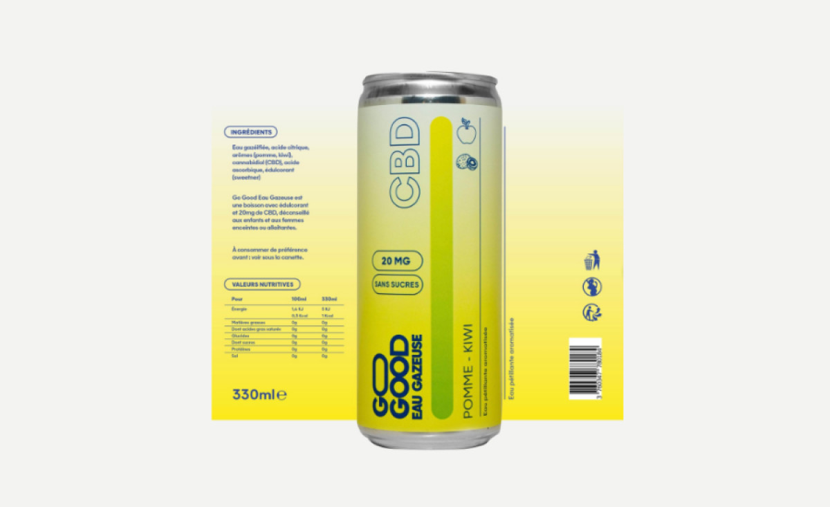
Go Good is a CBD-infused sparkling water brand that promotes wellness through refreshing, sugar-free beverages. To create a visually cohesive and engaging look, Glabiste Services developed packaging that embodies both relaxation and vibrancy. The design effectively communicates the product’s essence while ensuring strong shelf appeal.
A defining element of the packaging is its vibrant gradient color scheme. Each can features a smooth transition of hues that reflect the natural flavors inside, such as soft yellows for peach and deep purples for berry blends. The gradient effect not only enhances the visual identity but also reinforces the refreshing, soothing nature of the drink.
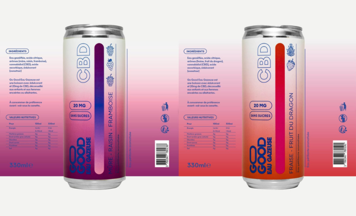
The minimalist and modern typography plays a crucial role in maintaining clarity. Bold, sans-serif lettering presents essential information, such as CBD content and sugar-free claims, in an easy-to-read format. The clean layout ensures that health-conscious consumers can identify the product’s benefits while still appreciating the aesthetics.
Further enhancing the design is the clear and engaging flavor differentiation. Each variety has a distinct color palette and small, illustrated fruit icons to make recognition effortless. This system helps customers easily navigate the options while reinforcing Go Good’s natural and wellness-focused branding.
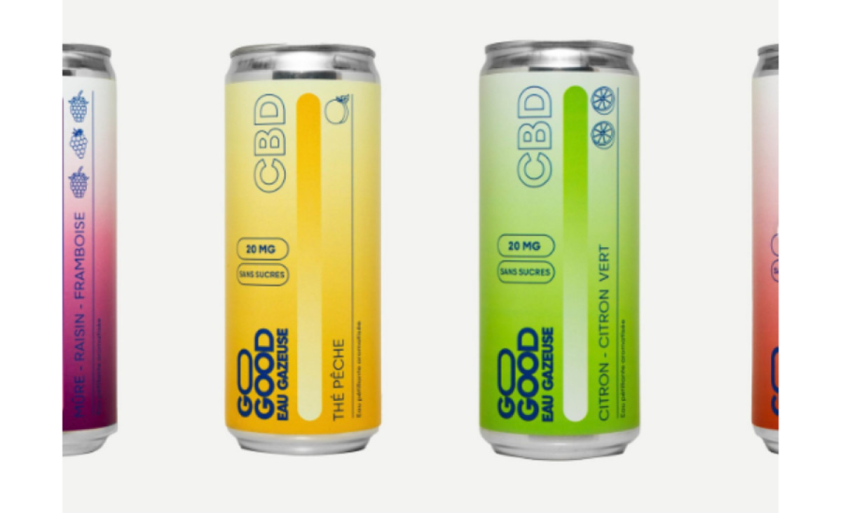
As a standout beverage packaging design, Go Good’s cans successfully merge style and functionality. With its striking gradients, modern typography, and intuitive flavor distinction, the design ensures the brand stands out in the competitive wellness drink market while staying true to its refreshing, CBD-infused mission.
-preview.jpg)