Team Behind the Design
Packaging Design Analysis
_45a8c233181f-desktop.jpg)
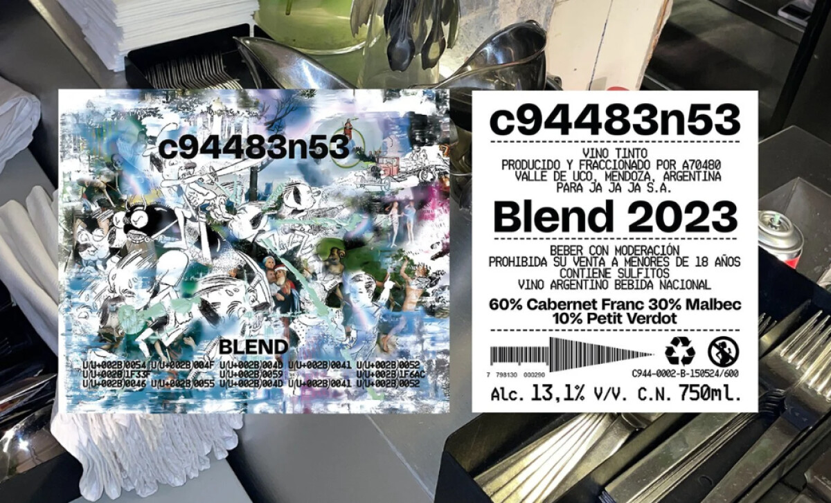
Structure, materiality, typography, and narrative are at the heart of compelling food and beverage packaging design.
At Heart Studio’s c94483n53_BLEND project pushes this further, making the bottle itself a medium for digital storytelling.
_2f8478c45ace-desktop.jpg)
- Concept: I think the coded name is a strong choice because it acts as both a product identifier and an artistic cipher, which creates intrigue.
- Visual Composition: The interplay between expressive abstraction and grid precision is effective. It feels kinetic and captures the spirit of experimental craft.
- Typography: The use of monospaced fonts is a key feature. It transforms the back label into a design manifesto. This creates a visual contrast that deepens the narrative.
- Color & Finish: Muted metallics and glitch-like purples give the label a unique texture. The glossy finish enhances the design's tactility.
What Brands & Agencies Can Learn from c94483n53_BLEND
This project offers a strong blueprint for any brand aiming to break convention in a traditional market.
1. Create Intrigue with a Coded Name
Ambiguity can be useful, and a little confusion can make people lean in instead of scroll past.A name doesn’t always have to spell out what the product does. When it’s slightly cryptic, it becomes part of the story, inviting people to figure it out.
Mystery can be more memorable than clarity. A name that asks people to think for a second stays with them longer. That moment of curiosity is powerful because it turns the audience from passive readers into active participants.
2. Treat the Back Label as a Canvas
The back of your package is a valuable design opportunity to extend your brand's narrative, not just a place for required information.
3. Bridge the Digital and Physical with Texture
If your design has a digital or futuristic theme, a tactile finish can create a compelling contrast. A glossy or metallic surface, for example, makes the physical object feel more special.
About DesignRush Featured Designs
At DesignRush, we review hundreds of agency projects each month. The featured works stand out for creativity, concept, and execution across design disciplines.
The most innovative projects advance to become Monthly Design Awards winners, recognized for pushing boundaries in visual communication and branding.
See more creative projects across categories:
- Best Packaging Designs
- Best Website Designs
- Best App Designs
- Best Logo Designs
- Best Print Designs
- Best Video Designs
For a full list of design agencies and related services, see our Agency Directory.