Standout Features:
- Minimalist, characterful line-based illustrations
- Luxurious, contrasting color palette
- Thoughtful typography with clear hierarchy
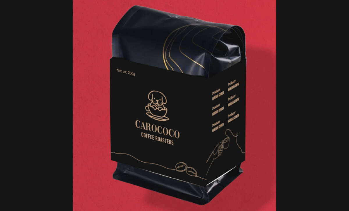
From a small coffee cart to a popular local shop, CaroCoco Coffee Roasters needed its packaging to match its growth and values. Thick&Thin Media took on the task of creating a design that tells a story of high-quality, ethically sourced coffee, capturing its artisan spirit and connecting with people who love good coffee and care about where it comes from. One feature that stands out is the clean, line-based artwork. The designers used subtle illustrations, such as the brand’s dog emblem and sketches of coffee-making elements, to add a unique feel. This keeps the packaging looking fresh and approachable, plus, it’s a clever way to make you feel connected to the product's artisanal quality.
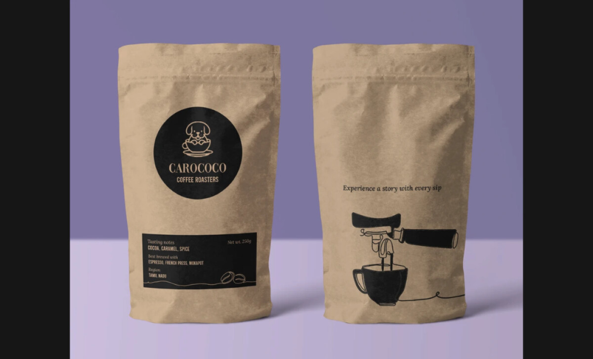
The coffee packaging's color scheme really makes a statement. The dark matte black combined with gold accents on one bag gives off an immediate sense of sophistication. And the other bag, with its natural kraft paper look, offers a nice, earthy contrast. This careful balance helps CaroCoco appeal to a wide range of coffee drinkers. The typography on CaroCoco's packaging is both elegant and easy to follow. You'll notice a clear organization of text, with the brand name prominent and key details like weight and flavor profiles easy to find. They use modern sans-serif styles, which adds to the clean, sophisticated feel and helps you quickly understand the product.
What we see with CaroCoco's packaging is a beautiful way to tell a brand's story using refined illustrations, a striking color mix, and clear typography. This shows other coffee businesses how your packaging can convey both sophistication and a genuine, ethical approach to make customers feel good about their choice.