- Designer: Dustin Byerley
- Client: Ojai Wild
- Category: Packaging Design – Skincare
- Location: Ojai, California, United States
- Project Brief: Translate Janna Sheehan’s hands-on perfumery process—growing, harvesting, and distilling native botanicals into an elemental brand and packaging system grounded in sustainability, craftsmanship, and artistic rigor.
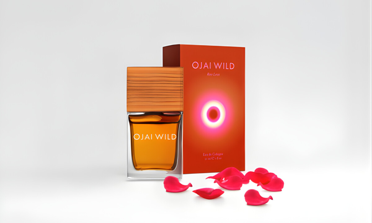
Skincare packaging design requires a balance of material honesty and a clear connection between the sourcing process and the final presentation.
Ojai Wild succeeds by stripping the architecture back to essentials, allowing the craftsmanship behind the product to define the brand rather than decorative excess.
- Materiality & Tactile Expression: The packaging relies on raw textures and natural substrates that mirror the brand’s botanical growing process. I believe this approach is effective in reinforcing authenticity and avoiding the polished artificiality common in the beauty category.
- Typography & Visual Restraint: Typography is understated and purposeful, supporting legibility without competing for attention. I think this level of restraint gives the packaging a sense of confidence, allowing the product itself to remain the primary focal point.
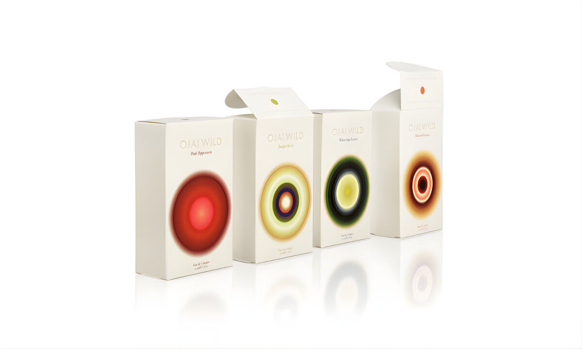
- System Cohesion & Product Hierarchy: The layout scales cleanly across the skincare line, using consistent structure to clarify product roles. I appreciate how hierarchy is communicated through proportion and spacing rather than graphic noise or high color saturation.
- Sustainability as Design Logic: Environmental responsibility is embedded into the core system rather than treated as a separate marketing layer. The material choices and reduced visual footprint make the packaging feel considered and durable, aligning design decisions with the brand’s values.
What Brands & Designers Can Learn from Ojai Wild
1. Let Materials Tell the Brand Story
Raw textures and natural substrates reflect the botanical origins of the products. When material choices mirror process and values, authenticity becomes immediately visible.
2. Use Restraint to Communicate Confidence
Understated typography and minimal graphics allow the product to take center stage. Visual quiet can signal quality more effectively than ornamentation in fragrance and skincare.
3. Build Cohesion Through Structure, Not Graphics
Consistent layouts and proportion-based hierarchy scale seamlessly across product lines. Clear systems reduce reliance on color or effects while supporting long-term growth and sustainability.