Team Behind the Design
Packaging Design Analysis
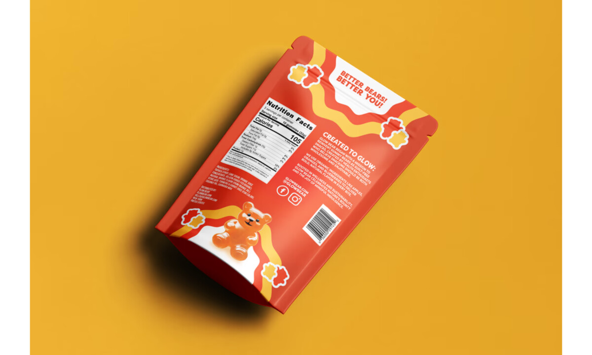
In reviewing this food and beverage packaging design, I paid close attention to how color, character, and structure worked together to create instant shelf recognition.
Glow Bear shows how a playful concept can still operate within a disciplined design system that feels intentional and scalable.
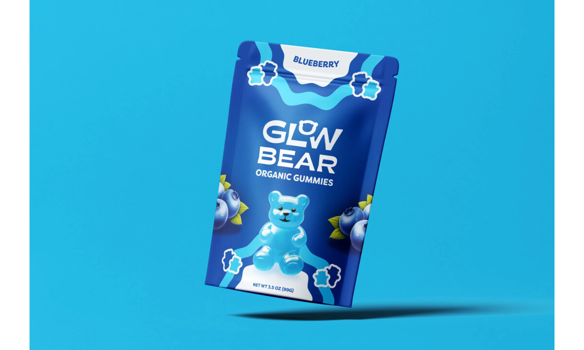
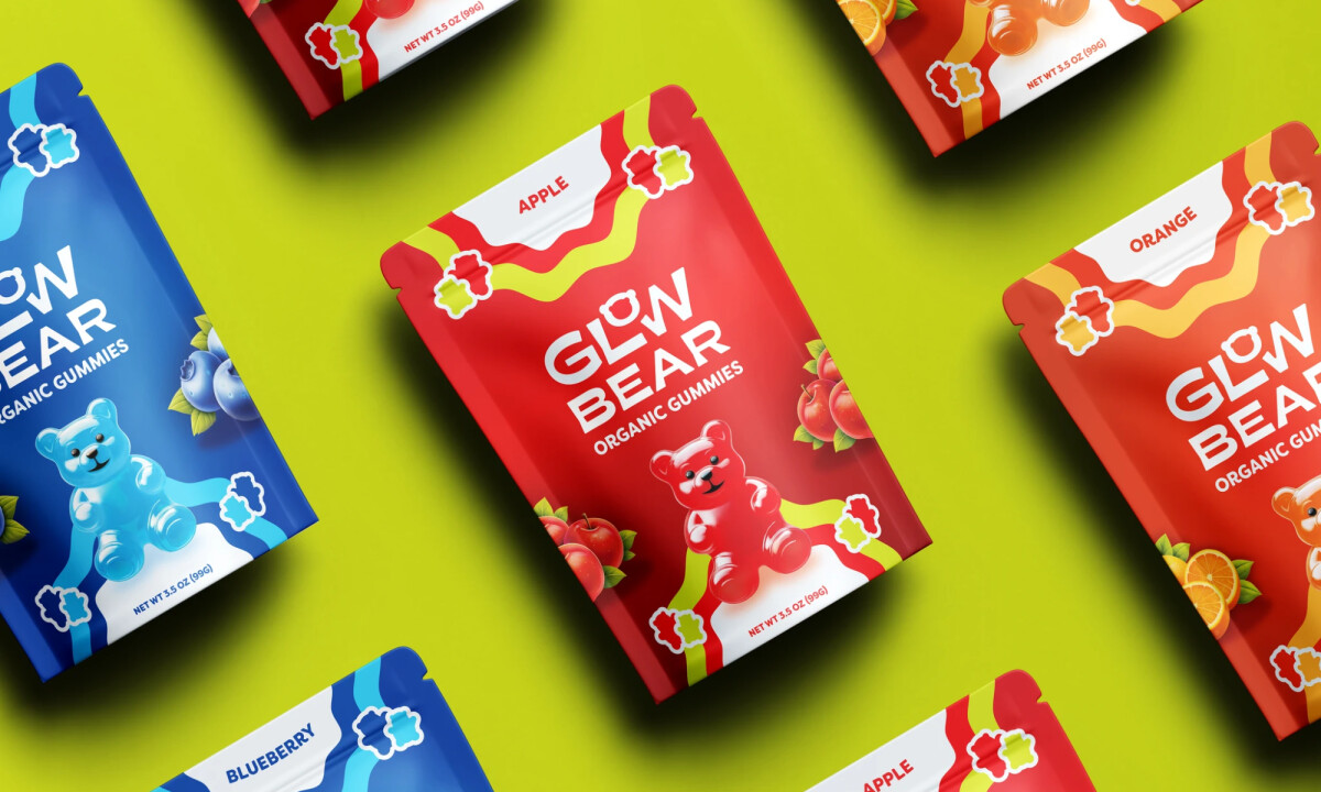
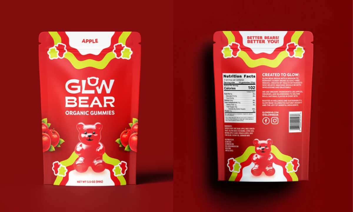
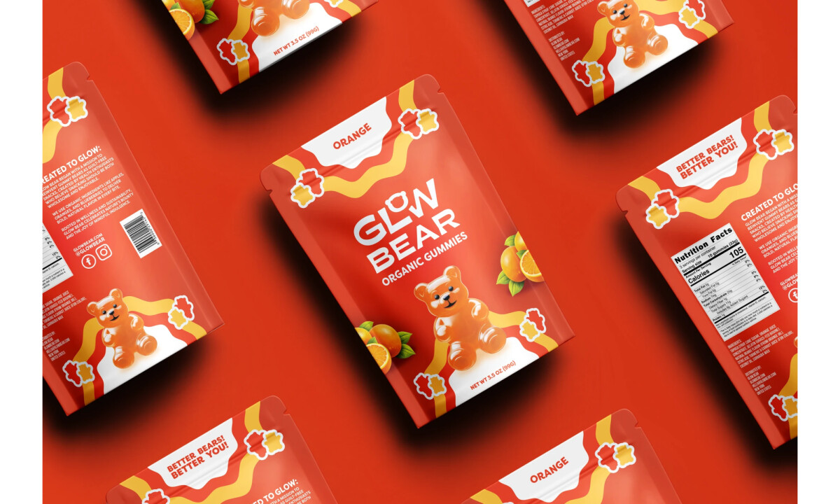
- Illustration System & Visual Language: The gummy bear character acts as a strong visual anchor, immediately communicating product type and tone. I like how the illustration remains consistent across flavors while adapting through color and supporting graphics to keep the system unified.
- Typography & Brand Voice: The bold, rounded typography reinforces the friendly, energetic personality of the brand without sacrificing clarity. I find the hierarchy effective, especially how the product name and flavor are easy to scan at a distance.
- Color Palette & Flavor Differentiation: High-saturation colors clearly distinguish each flavor while maintaining a recognizable Glow Bear look. I appreciate how the palette feels purposeful rather than chaotic, allowing variation without fragmenting the brand.
- Packaging System & Shelf Impact: The pouch format, combined with consistent layout and graphic rhythm, creates a strong repeatable system across the lineup. I see this as a design that performs well both individually and as a grouped shelf presence, supporting long-term brand growth.
What Brands & Designers Can Learn from the Glow Bear
1. Anchor the System with a Recognizable Character
A consistent mascot creates instant recognition and sets tone at shelf level. When a character is used thoughtfully, it becomes a flexible asset rather than a gimmick.
2. Balance Playfulness with Clear Hierarchy
Bold typography and simple layouts keep product names and flavors easy to scan. Even expressive brands need disciplined structure to support clarity and growth.
3. Use Color to Drive Variety Without Fragmentation
High-saturation palettes differentiate flavors while maintaining a cohesive look. Strong color logic allows a lineup to feel diverse and unified at the same time.
About DesignRush Featured Designs
At DesignRush, we review hundreds of agency projects each month. The featured designs stand out for creativity, relevance, and execution.
Many go on to be recognized as winners of our Monthly Design Awards.
Explore more creative work here:
- Best Packaging Designs
- Best Website Designs
- Best App Designs
- Best Logo Designs
- Best Print Designs
- Best Video Designs
For a full list of design agencies and related services, see our Agency Directory.

-preview.jpg)
-preview.jpg)