Standout Features:
- Japanese medical-style packaging
- Upfront nutritional labels
- Retro-inspired color palette
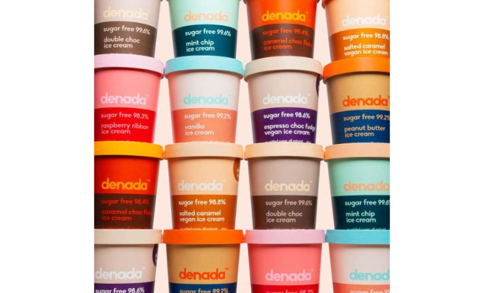
Denada is an Australian ice cream brand that literally means “it’s nothing.” Although it offers everything when it comes to the flavor profile, the designers at Jo Cutri Studio took those words to heart in creating this simple yet sophisticated ice cream packaging design.
First of all, Denada is stripped back of any additives. Wellness fans and fitness buffs, rejoice! This is an all-natural sweet treat that you can enjoy without worrying about the calories.
To highlight that, they added content labels like the sugar level, “low carb” and “no added sugar” right on the front. A guilt-free option indeed!
Also, the pops are contained in pints and boxes that are inspired by Japanese medical products. Besides emulating the softness and sleekness of those materials, such style choice further reinforces the brand’s “healthy” positioning on the market.
It’s not too simple, though. To compensate for the lack of extravagant visual elements, the designers used a spectrum of colors to bring out the brand’s fun and retro vibe.
Each package and flavor come in a vast array of color pairings like pink and red, yellow and blue, purple and pink, and so on. Altogether, the items are an absolute standout in a sea of options in stores and supermarkets.


