Standout Features:
- Vibrant tropical color palette
- Handcrafted watercolor illustrations
- Thoughtful windowed packaging design
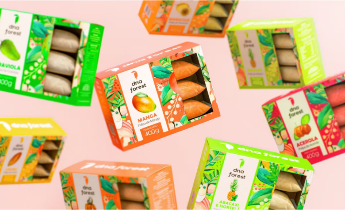
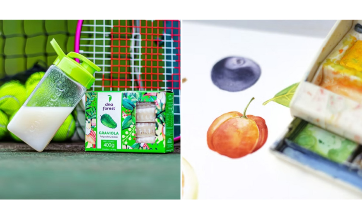
DNA Forest, a fruit pulp brand, needed packaging that visually captured Brazil’s tropical vibrancy while appealing to both national and international markets. Estudio Arth brought this vision to life through rich watercolor illustrations and a dynamic design approach. The result is packaging that feels fresh, natural, and deeply connected to the brand’s origins.
A defining feature of the design is its vibrant tropical color palette. Each package bursts with colors inspired by the fruits inside, using bold greens, oranges, and reds to reflect their freshness. The contrast between these bright hues and the crisp white labels creates a visually striking effect, making the products instantly recognizable on the shelf.
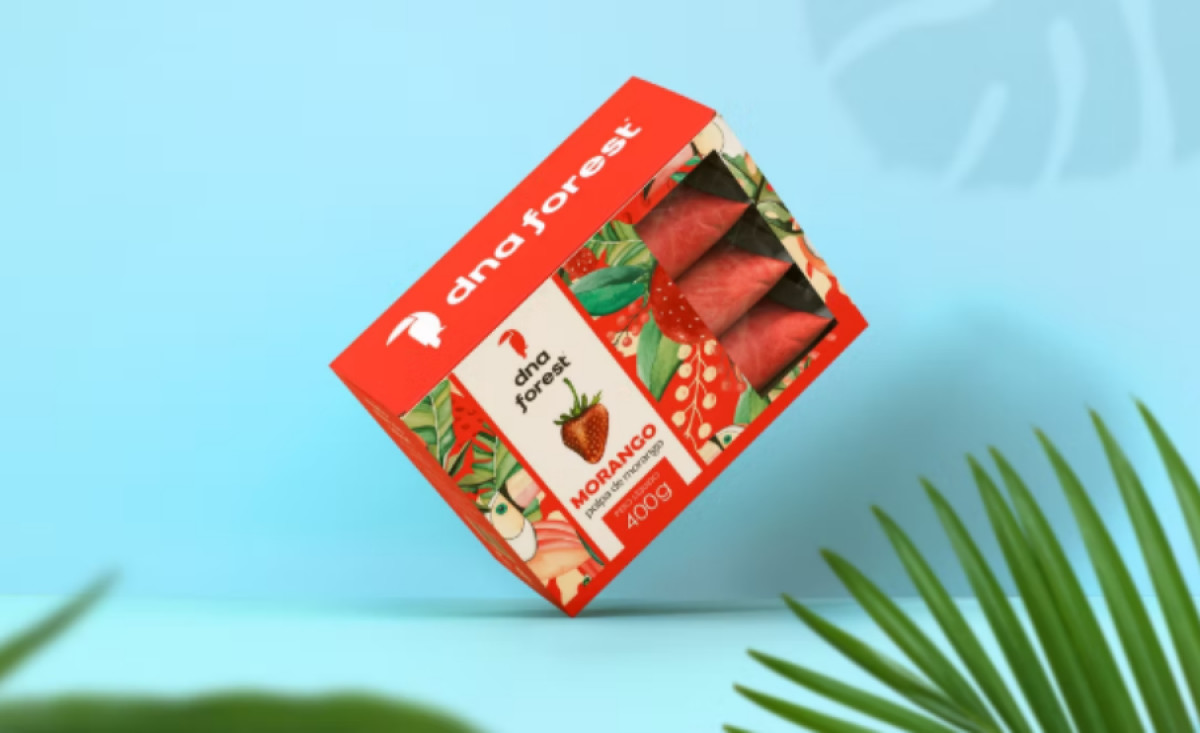
The handcrafted watercolor illustrations elevate the packaging by adding an artisanal touch. Each fruit is painted in a detailed, organic style, reinforcing the brand’s commitment to natural ingredients. The tropical foliage patterns surrounding the products further immerse consumers in a fresh, exotic experience, evoking the lush landscapes of Brazil.
Functionality is also prioritized with the thoughtful windowed packaging design. A transparent cutout allows consumers to see the frozen fruit pulp inside, building trust in the product’s quality. This feature not only enhances visual appeal but also strengthens the connection between the packaging and the natural goodness of the ingredients.
With its bold colors, artistic illustrations, and smart design choices, DNA Forest sets a new standard for beverage packaging design. Estudio Arth has successfully crafted an identity that blends visual storytelling with practicality, ensuring the brand stands out in both local and global markets.