It’s hard to make pizza look bad. It doesn’t matter if the pizza shows up in a dirty shoe; there a lot of people that wouldn’t be able to turn down their favorite food. With that said, making pizza look great is a much more effective strategy.
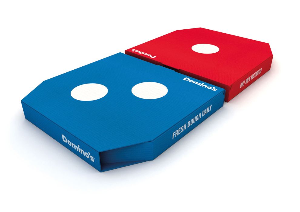
The design team at jones knowles ritchie created a bold and clean design for Domino’s that takes into consideration the buying habits of Domino’s customers to create an eye-catching, creative design. Domino’s knew that 96% of their pizzas were sold in pairs so jones knowles ritchie created a two-piece design that shows off Domino’s colors in a simple, eye-popping color.

The old design for Domino’s pizza box was messy. There were several different types of typeface competing with each other as well as various illustrations mixed in as well. Needless to say, the design was cluttered and unattractive. The new red and blue boxes are a hard pivot from the old design. Simple, bold, white text accents the solid colors with basic statements about the product.
The creativity and use of space, however, is the most impressive part of this design. Instead of creating one single pizza box, the designers used product knowledge to turn two pizza boxes into one coherent packing design that shows off Domino’s logo.
This is truly a clever design that’s bold and creative. As we said, it’s hard to make the pizza look bad but Domino’s has pushed the envelope and made pizza look great.
Domino's is a bold packaging design in the Food & Beverage industry.

-preview.jpg)

