Standout Features:
- Bold and oversized typography
- Vibrant and differentiated color palettes
- Playful illustrations
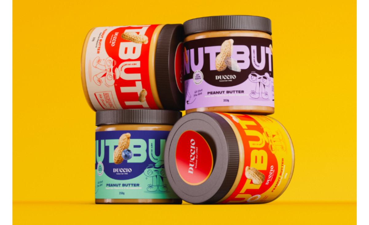
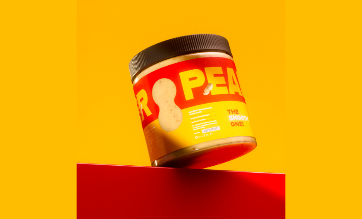
The Duccio peanut butter packaging, designed by Denny Di Pasquantonio, is a bold and eye-catching example of modern food packaging. The design skillfully combines visual impact and functional clarity, making it both memorable and practical.
The label's oversized typography takes center stage. This not only enhances visibility on shelves but also aligns with the product’s confident and approachable branding. Still, the label balances its bold visuals with practical elements, such as nutritional information and product details, positioned neatly and legibly across the design.
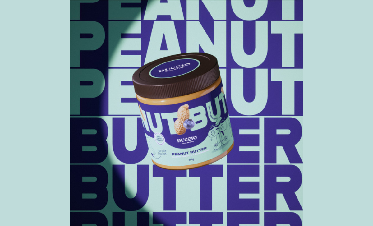
Each flavor of Duccio’s peanut butter features a distinct color scheme, such as red (roasted peanuts), pink (roasted peanuts and dark chocolate), and even blue (peanut butter with blueberries!). These bold choices create strong visual differentiation, helping consumers easily identify their preferred variety.
The inclusion of lighthearted, sketch-style illustrations, like quirky peanut characters and blueberries, adds a layer of fun and personality to the packaging. This approach appeals to a younger audience while reinforcing the brand’s focus on creativity and enjoyment.
The Duccio peanut butter packaging is a vibrant blend of bold aesthetics and thoughtful design. Denny Di Pasquantonio has successfully created a visually engaging food and beverage packaging design that stands out on shelves and connects with consumers through playful branding and impactful design elements.

-preview.jpg)