Standout Features:
- Clear plastic bag packaging
- Prominent brand name placement
- Color options per variant
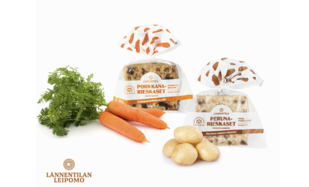
For the bread packaging design of Lännentilan leipomo, the packaging design agency Mint Station focused on a practical yet visually appealing approach. They used clear plastic bag packaging, allowing consumers to see the product. Brand name placement is also prominent for easy identification and strengthening brand recall.
Another standout feature is the color-coded option for every variant. This approach makes differentiating each flavor easier and adds a playful and distinctive touch to the packaging.
Get a chance to become the next Design Award winner.
SUBMIT YOUR DESIGN
-preview.jpg)
-preview.jpg)