Standout Features:
- A cool color aquarelle
- Soothing visuals
- An inviting logo design
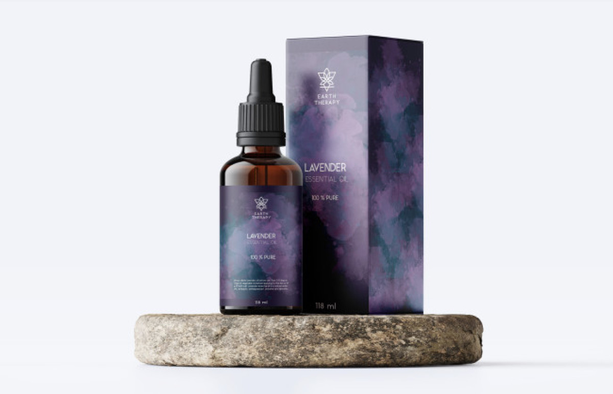
The next entry on our best cosmetic packaging designs list is EARTH THERAPY by Dragana Komljenovic.
The delicate emblem design represents a curious blend of alchemical symbols for the earth and the leaves, forming a stunning visual of a lotus in an inverted triangle. The logo design is set on the top of the bottle label, painted in an amazing color aquarelle technique.
Apart from the limited white typeface for branding purposes, the packaging design relies solely on this delicate aquarelle artwork. The stunning visuals are predominantly purple, referring to lavender as a star ingredient. Multiple shades overlap and create a soothing atmosphere that encapsulates all the plant’s healing properties.
Get a chance to become the next Design Award winner.
SUBMIT YOUR DESIGN