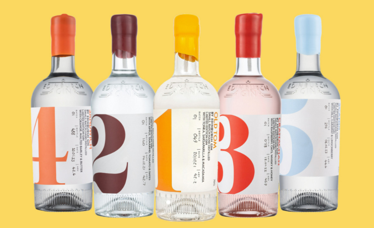
Standout Features:
- Clear and vibrant bottle design
- Large-scaled numbers
- Colored labels for product variation
The packaging design for Edinburgh Gin by Second Language Design Consultants captures the true essence of this renowned distillery. The clear, long-neck bottle showcases the gin's clarity, inviting connoisseurs and curious newcomers alike to appreciate its craftsmanship.
Every bottle has colored necks and large numbers – each representing a unique variant. They add a playful touch that transforms the bottles into a vibrant collection. This clever use of color aids in quick identification and creates a visual feast as enticing as the gin itself!
Lastly, the labels complete the bottle's look with elegant typography and subtle illustrations. These details provide essential information while maintaining the brand's sophisticated aesthetic.

-preview.jpg)

-preview.jpg)