Standout Features:
- Creative, meaningful name and branding
- Attention-drawing, vibrant red accents
- Subtle, symmetrical geometric patterns
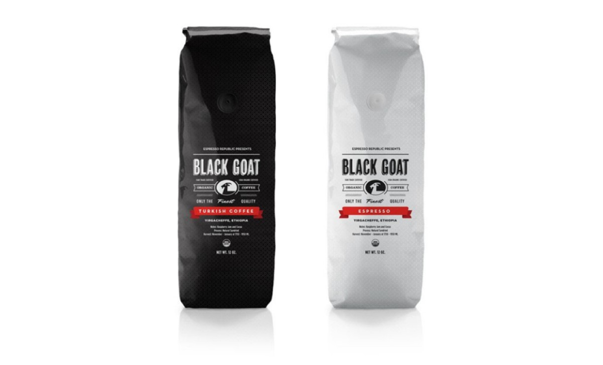
Even though the name might appear random at first glance, there's a creative, meaningful story behind it. Espresso Republic’s Black Goat Coffee draws its identity from an age-old Ethiopian legend — a tale of a goat herder who discovered his goats becoming lively after feasting on mysterious berries.
Consequently, at the core of Black Goat Coffee packaging, created by Garage Design Studio, lies a creative, meaningful branding that invites curiosity. Bold typography and a striking goat logo command attention, reinforcing the brand’s heritage and its commitment to quality.
Adding to the dynamic visual appeal are attention-drawing, vibrant red accents. These vivid red strip-like shapes aren’t just eye candy — they highlight the coffee’s distinct flavors and types, guiding your gaze and adding an energetic pop against the backdrop.
Completing the design is a subtle, symmetrical geometric pattern. This refined element is deliberately understated, offering a sophisticated backdrop that ties the whole look together. The pattern’s symmetry mirrors the consistent, single-origin quality of the coffee, reinforcing the notion of craftsmanship that defines Black Goat Coffee.