Standout Features:
- Natural textured finishes with an earth-toned color palette
- Minimalist typography and red color accent
- Cohesive structural and visual hierarchy
Erbavita Group’s cosmetic line packaging, designed by Diligo, reflects a brand that blends herbal expertise with pharmaceutical precision. For consumers who seek organic and responsibly made beauty products, this packaging aims to communicate both the natural origins and the scientific efficacy of the contents within.
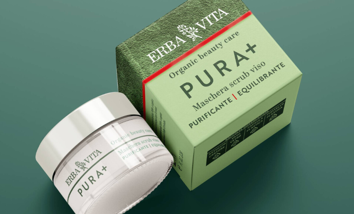
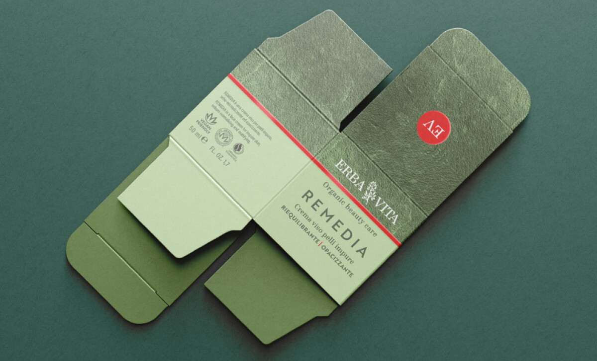
The packaging employs textured surfaces that evoke natural materials, lending an almost embossed quality to the boxes. This tactile approach is impactful, as research form Laraichi and Pantin-Sohier (2020) indicates that packaging textures perceived as rougher can significantly enhance consumer perception and trust of a product.
Additionally, muted earth tones like sage green dominate the color scheme, aligning the products with nature and wellness, while differentiating product lines through subtle color shifts.
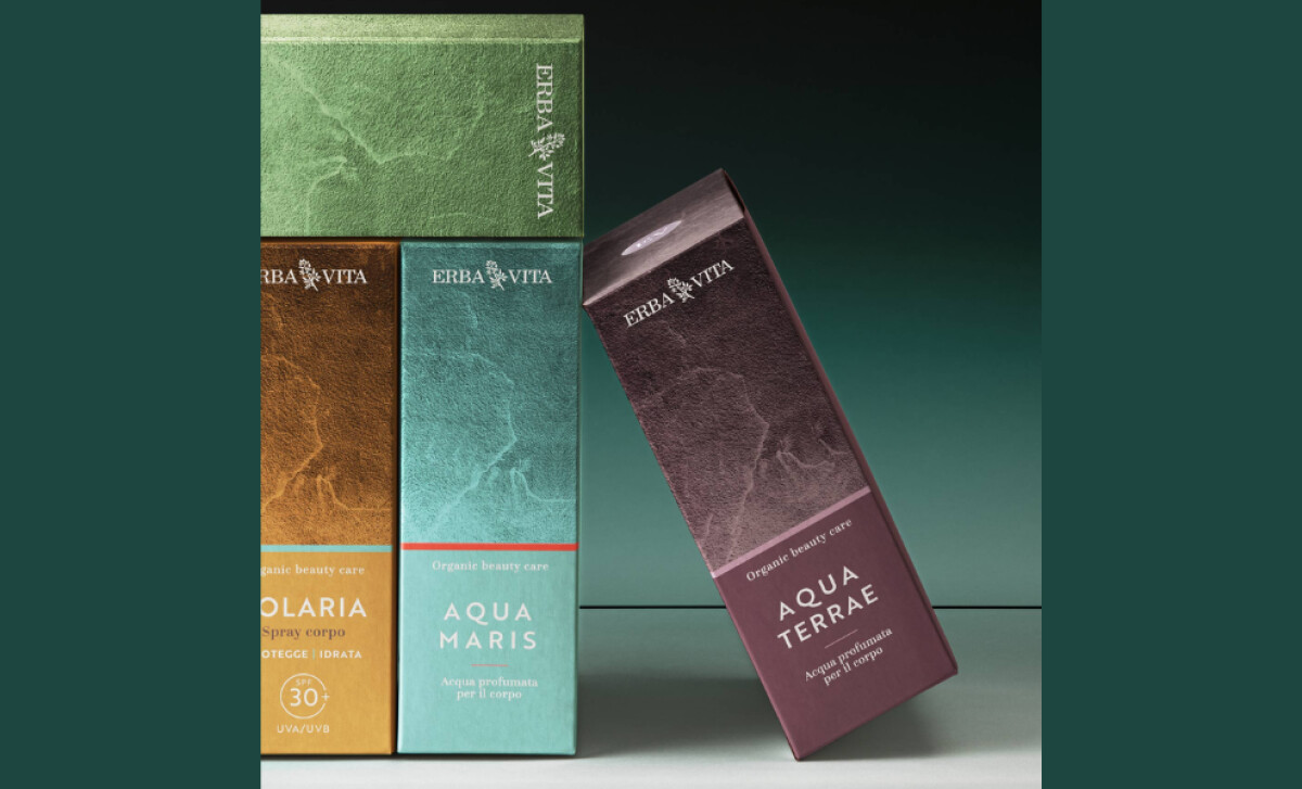
The brand name “ERBA VITA” is set in a classic, elegant serif font, rendered in light text against the textured backgrounds. On the other hand, product names and descriptors use clean sans-serifs. A striking red accent line also wraps around the packaging, drawing attention to its written benefits.
A disciplined hierarchy defines the health and wellness packaging’s layout, which is clean and well-structured. There's a clear segmentation between brand elements, product names, and benefit descriptions. This organization allows customers to quickly understand the product's purpose and value.
Ultimately, Erbavita’s harmonious integration of textured materials, refined typography, and purposeful color accents creates a brand experience that is both sophisticated and reassuringly authentic.