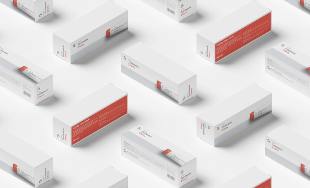
Standout Features:
- Minimalist tube packaging
- Flavor-matching caps
- Clean, Google-inspired layout
Shiva Moin created an innovative packaging design for Google Toothpaste, a fictional product that adheres to Google's well-known design guidelines.
Following the brand's design principles, the packaging embraces a minimalistic approach. Its simplicity reflects Google's commitment to straightforward, user-friendly designs, while the clean lines create a modern and sophisticated look.
One playful aspect is the flavor-matching cap design. Each cap is color-coordinated with the flavor label on the tube, matching the iconic Google colors: red, yellow, and green.
The best part? The designer incorporated the iconic Google Grey 300 hue into the packaging. While this color is not as prominent as the main brand colors, its subtle inclusion adds depth and instant recall.
-preview.jpg)