Standout Features:
- Bright, bold color blocking
- Quirky illustrated characters
- Clear, friendly messaging
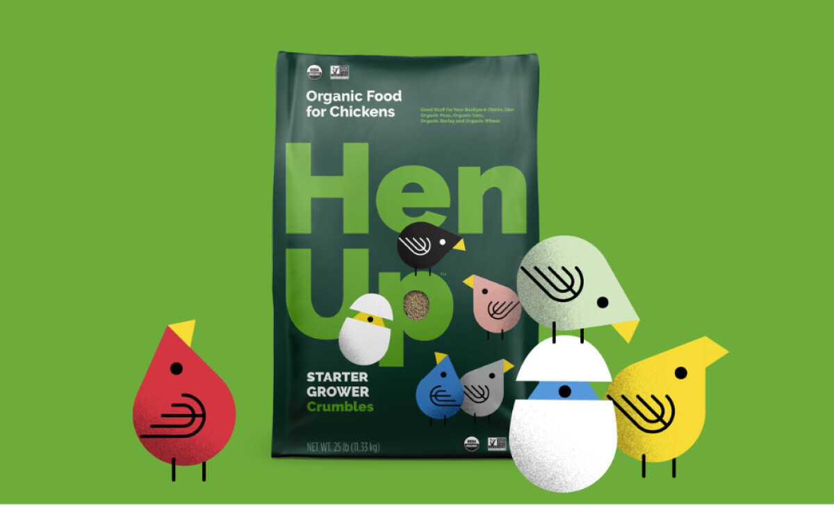
At Hen Up®, chickens aren’t just livestock — they’re family. Acre Design Co brought this spirit to life through a vivid and charming packaging design. Merging joyful illustrations and clear nutritional messaging, the packaging invites customers to fall in love with their feathered companions and the brand itself.
Hen Up's packaging uses large swaths of solid, saturated colors of deep purple, firetruck red, grass green, and navy blue, which create immediate shelf impact. Color is a clever way to increase brand recognition, so how each product variant is differentiated here enhances memorability and helps consumers easily identify the right ones.
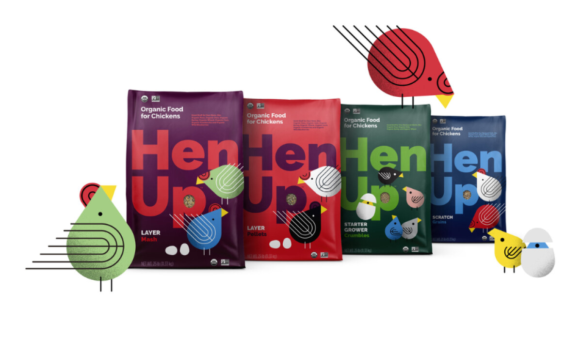
It also features playful, geometric chicken illustrations — some hatching from eggs, others strutting proudly — that reflect the brand's messaging about chickens being “weird, wonderful, and wildly entertaining.” Packages with characters can increase purchase interest, so the charming visuals also give the packaging a storytelling dimension that sells.
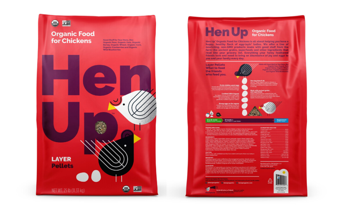
On both front and back panels, Hen Up's messaging is simple, conversational, and heartwarming, with phrases like “What to feed the friends who feed you” and “Everything your funny feathered friends need.” Combined with easy-to-scan nutritional highlights and USDA Organic certifications, the packaging balances warmth with trustworthiness.
Hen Up’s retail packaging design‘s joyful characters, colors, and honest messaging make it a standout on shelves — and in hearts. For brands aiming to elevate their packaging, Hen Up is a prime example of how storytelling and emotional connection translate seamlessly into product design.