Young Willow’s Strong Branding Emphasizes The Tenderness Of Newborns & Children
Young Willow is a unique and thoughtful brand that specializes in creating soft and fun baby gifts. This Australian-based business connects consumers with stellar gifts that are perfect for ushering in their latest baby arrival.
From baby clothes and toys to musical instruments and bibs, this chic and sophisticated company really has it all.
And to encourage more consumers to turn to this stylish and thoughtful brand, Young Willow enlisted the help of design studio Studio Marche to help create a packaging that was soft, subtle and perfectly serene -- everything new parents idealize.
Studio Marche is a design company dedicated to helping brands with strategy, brand identity, social media, package, print and web design. They’re an agency that has it all and does it all, enabling them to create a well-rounded brand identity and image for themselves as well as their clients, such as Young Willow.
According to the design agency:
Melbourne based mum Emily Wilson founded Young Willow with the sole purpose of showering new mums and bubs with precious and delightful gifts. Her beautifully curated boxes – with collections of handpicked products – called for a brand as equally beautiful, with prestigious packaging to match. Taking cues from current fashion trends, the overall experience, including a comprehensive online store, was created with dedication to attention to detail that makes each customer’s interaction with the brand truly special.The agency was tasked with creating an entire image for the boutique baby brand, and the resulting identity that sprouted is sophisticated, subtle and strong. It’s an identity that perfectly captures the delicate essence of Young Willow and its products.
Using sweet and soft elements, and incorporating a bombastic twist, this brand’s identity was elevated tenfold with the help of this innovative and exciting design agency.
But for now, we’re going to dive more specifically into the packaging that this brand produces.

Young Willow's Packaging Designs Showcase Childhood Serenity Through Pastel Colors
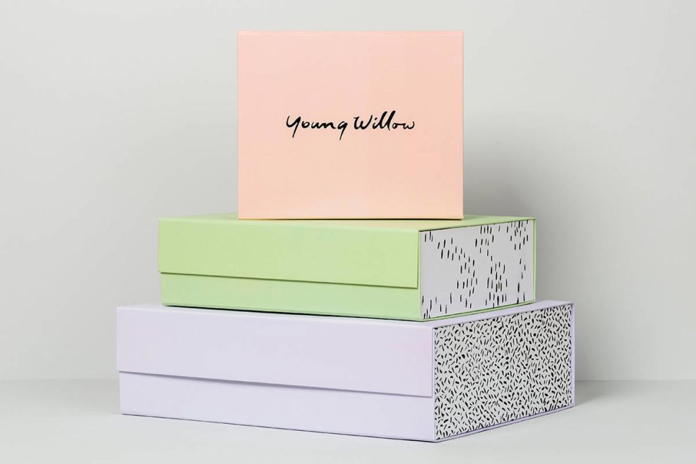
This design wows with pastel coloring. The boxes are coated with a soft, serene and sweet matte pastel color that immediately puts viewers at ease and encourages thoughts of babies and children.
These overlapping boxes are covered in light pastels — blues, pinks, purples and other daring pastels ass a soft edge that excites and inspires. And pastels are known to have a strong impact.
According to the ideas found in color psychology, pastels create an air of tranquility and peacefulness. These colors have a subconscious effect on the human mind, and marketers have been putting colors to great use as a result.
These lower pigmentations create a serene vibe that puts users at ease. They promote togetherness and cohesiveness. They inspire soft inspiration and creative tranquility. Pastels instill calmness. They instill serenity and beauty.
Pastel colors are delightful and clean, limiting the chaos and confusion that comes from more bright, bold and dynamic colors. These hues, in particular, embody the soft, gentle moments parents often experience in their nurseries with newborns and children, giving them even more meaning in the package designs.
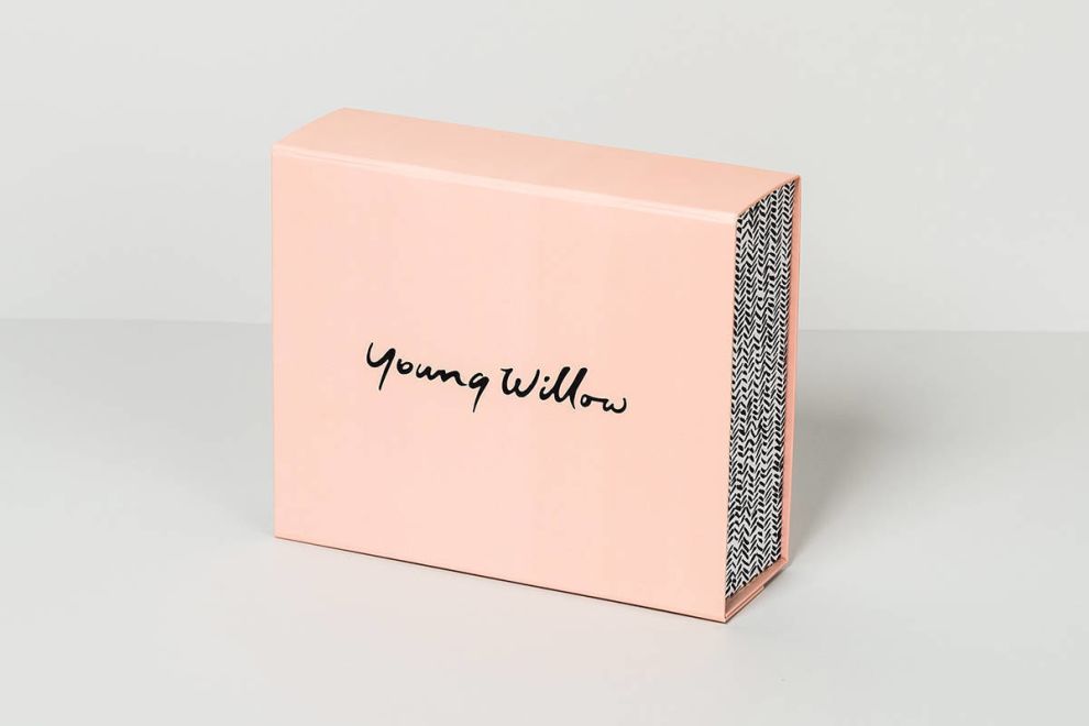
And to elevate the smoothness that comes from the use of pastel colors, the Young Willow brand name adds another layer of fluid creativity. It’s soft and sophisticated in its curly, cursive font. And the letters flow from one to the other with ease and beautiful excellence.
This creates a much needed, relaxed air to the design making the box itself stand as a gift in and of itself.
But these colors are also intentional for a reason — this is a brand that works with baby items. They are a store for boutique baby gifts, and what better colors should be used to emulate that mission than pastels. These are the first colors we think of when it comes to babies.
These are the colors we use to paint nurseries and design baby clothing. So placing them on these packaging designs is a perfect choice.
This Packaging Opens With A Colorful Twist, Communicating A Secondary Message Through Visuals
But while the pastels are on-brand and in line with the brand’s messaging and target demographic — and they certainly put viewers at ease — there is still a level of engagement and excitement that hides inside these clever box designs.
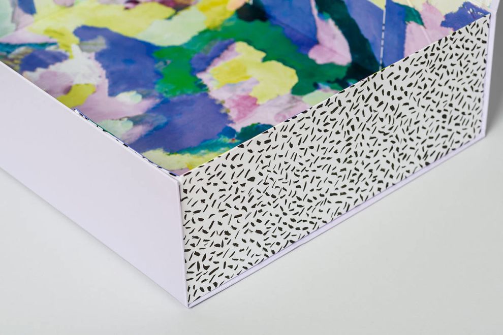
This soft excitement stars on the boxes shorter sides. Instead of being wrapped in the same pastels as the surrounding sides, these surfaces are wrapped in a white background, with dazzling black patterns on the surface. These patterns include dots, chevrons and other geometric shapes. It’s exciting and subtle, adding a more dynamic and creative layout to the design that breathes even more life into it.
But it’s the inside of these boxes that really excite.
When you open up the flaps of these box designs, the inside surfaces jump out at you. They’re made up of an array of colors and patterns — they’re cool, creative and fun.
They excite in a subtle and serene way that perfectly balances out with the sophisticated and calming nature of the pastels that line the outside of these boxes.
These watercolor masterpieces are dynamic and outstanding. Bright and vivid colors — from bright oranges and yellows to captivating blues and purples — add an excitement that is unavoidable and pleasing.
This strikes an interesting dynamic — the outside is soft and simple, the inside is bright and bombastic.
These two varying color palettes and patterns juxtapose one another and perfectly demonstrate parenthood. Some moments are tranquil, others are chaotic. But each day -- and every child -- is colorful and unique, just like Young Willow's packaging designs.
The overall design is serene and spectacular, showing off the brand’s fun and playful personality and elevating these boxes as a work of art in and of themselves. It’s not often a number of different colors and pattern combinations that can all work together seamlessly. But the many contrasting colors and patterns inject a great element of personality into the boutique baby gift boxes that can’t be ignored.

Young Willow Chose Boxes Over Bags To Add Structure, Organization & Unique Artistry
Boxes are a traditional packaging design, of course. But when it comes to packaging clothes, more often than not you’ll see brands and designers turning to bags. They are easier to create, easier to maneuver and — considering most consumers will toss the packaging anyway — they take up less work to create in the long run.
But the team at Studio Marche shied away from the easy design choice and went with a clever and crafty box structure to package these stunning and thoughtful baby presents. And these boxes are more interesting than you might think.
It’s not your traditional box — like the kind you’d find at the post office. No instead, it’s made up of an overlapping flap that closes the box and creates a more theatrical opening experience. The inner box almost sits inside the layered outside box. It’s dimensional and layered and deep.
It’s also a strong and structured design that sits on its own — regardless of the products that lie inside. It’s a work of art all on its own. The materials are strong and sleek. They are geometric and powerful.
These boxes are sophisticated packages that keep delicate care of the gifts inside. It’s innovative, and creative in design, working as the perfect base for the colorful creations that sit on the surface and sit inside of its solid, strong siding.
Young Willow’s Packaging Excels In Its Soft Simplicity
These Young Willow package designs are a beautiful display of artistic excellence. They walk a fine line between simple and minimal, and creative and show-stopping.
At first glance, these soft and sophisticated designs shine due to the fluid and graceful brand name, and minimal copy otherwise. There’s also the beauty in the subdued and elegant pastel covers that coat these boxes in a matte layering that oozes a softness and a luxury that is unparalleled in the baby boutique industry.
Pastels are intimately engaging. They exude a softness and a refined elegance that creates an atmosphere of class and coolness. Pastels are nostalgic and simple. They harken to better, younger days. They add a lightness, a brightness and an airiness that excites and tantalizes.
It’s the perfect color choice for a baby boutique store — these pastels are often the first colors introduced to babies and are used in many a baby color scheme. So this was a distinct choice on the part of the designers.
But just because pastels take the main stage, doesn’t mean these designs don’t dazzle.
Open the boxes and get ready to be surprised. Exciting and crafty patterns line the insides of these boxes in a myriad of ways. Zebra patterns, cheetah prints, florals and watercolors are just a handful of the patterns integrated into these designs — but there’s a softness and a creativity that you can’t resist.
And in some way, there’s a cohesiveness here that you almost can’t believe. The watercolors add a softness, a simplicity and a colorful ambiance that’s simply stunning.
The overall shape and structure here are also profound. Instead of being packaged in a simple bag, this brand used boxes in a way that puts the products inside on clear display. This adds a regalness, a prestige and a clear dominance in the industry that blows gift-givers away.
These designs capture the classical elegance of the brand and its products. They’re powerful and fluid — offering up a sneak peek into the thoughtfulness of the brand and promoting its product with class and sophistication.


