The King of Candy, a handmade candy brand owned by traditional confectioners, collaborated with designer Kostis Sotirakos to create a packaging design that reflects the brand’s vibrancy. The result is a unique jar packaging that balances artisanal craftsmanship with playful aesthetics, featuring handwritten fonts, a clear container, a quirky logo, and a pastel color palette.
Key Insights for Brands:
- Utilizing soothing pastel tones in your packaging design evokes approachability, enhancing its resonance with a broader audience
- Handwritten typography communicates your brand's artisanal, non-industrial essence
- Using transparent containers encourages customer trust and makes your product part of the design
King of Candy Fuses Traditional Craftsmanship With a Contemporary Brand Image Evident in Its Label Design
The King of Candy aims to create a memorable and friendly brand identity through its packaging design.
To achieve this, Kostis Sotirakos balances traditional craftsmanship and modern aesthetics by using classical elements like handwritten fonts and vintage-inspired transparent jars, highlighting the beauty of artisanal candy-making.
Moreover, the designer injects a friendly and playful image into the design using a pastel color palette and strip labels. These labels are a delight on their own. The strip has two circular ends, containing the essential product details, drawing curious customers in with its simple yet functional design.
Adding flair to the strip label is the eye-catching line art of a bearded man wearing a candy bow tie, sunglasses, and a crown. This logo symbol embodies the brand's uniqueness while aligning with its modern and playful tone. It also reflects the brand’s mission to connect with a broader, younger audience.
The clever fusion of traditional elements with modern label design conveys that the brand respects timeless candy-making while appealing to present-day packaging layouts. Together, the design elements cultivate a vibrant personality, enticing consumers to explore the delightful world of King of Candy.
The Design Exudes an Artisanal Appeal by Combining Serif and Handwritten Typography

Some of the best packaging designs utilize handwritten fonts to emphasize the product's non-industrial essence. Here, Kostis Sotirakos employed a signature-like script indicating the flavor.
This style suggests that each jar is part of a small batch, with a carefully prepared selection, underscoring the authenticity and exclusivity of the sweets. The handwriting style feels intentional, reminding customers of the passion for producing each flavor.
This personal touch reinforces the brand’s commitment to artisanal craftsmanship, evoking the charm of homemade candy. By including handwritten labels, King of Candy conveys a sense of intimacy that enhances the product’s visual appeal and ensures that customers feel connected to the tradition behind each sweet treat.
Contrasting with the handwritten font is the logo's serif typography, adding a professional air to the overall design. This is a beautiful contrast as the cursive font communicates approachability and next-door-neighbor aura; the formal and straightforward serif font cements the brand's authority. A subtle yet powerful message!
Every King of Candy Package Reflects Gentleness and Flavor Variety With a Pastel Color Palette
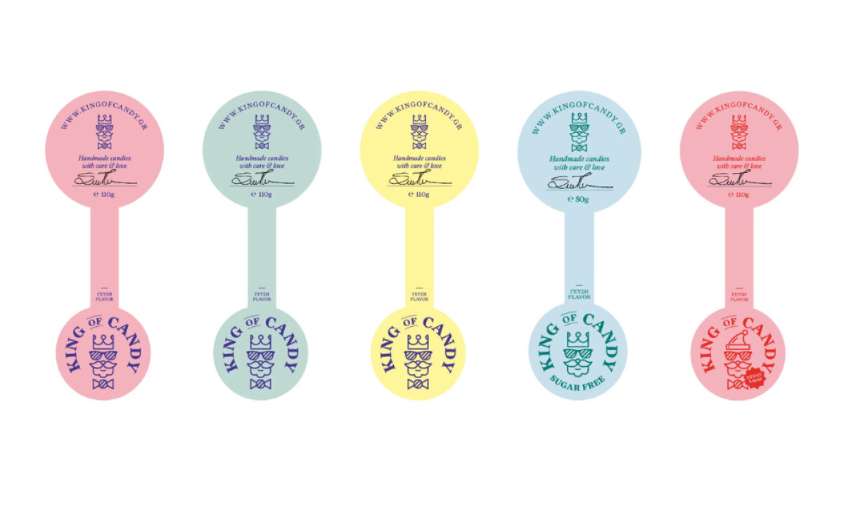
The soft pastel hues used across King of Candy’s packaging reflect the brand's values of gentleness, care, and delight. These soothing tones bring a calm atmosphere that complements the product’s playful nature.
The pastel colors suggest that candy-making is not just a business but an art, requiring precision and patience at every step. Moreover, these calm colors exude approachability that resonates with a broad range of customers.
In addition, the color-coded labels play an essential role in visually communicating the flavors — blue represents ouzo, pink hints at fruit mix, and other shades align with various taste profiles. This thoughtful use of color helps customers quickly identify their desired candy, adding visual charm and functionality.
Transparent Jars Enhance Trust and Showcase King of Candy's Product
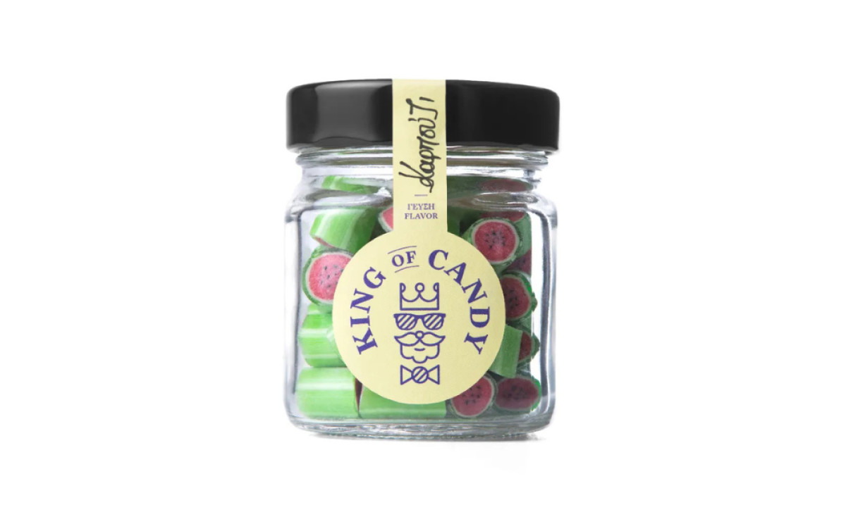
The designer strategically used transparent jars to allow the vibrant, joyful candies inside to take center stage. By using clear containers, the design eliminates distractions, allowing customers to see the product's vibrant colors and unique fruit-like shapes.
Many exquisite packaging design agencies use see-through packages to build trust and reassure buyers that they know exactly what they are getting.
Furthermore, these jars are a great design choice, as the candy’s playful colors seamlessly synchronize with the cheerful vibe of the packaging. Avoiding complex imagery or overly designed labels keeps the aesthetic minimalistic and straightforward, reinforcing that King of Candy values quality above all.
Through its thoughtful harmony of vintage jars, authentic manuscripts, pastel colors, and a quirky logo, King of Candy’s packaging stands out as a true celebration of craftsmanship and creativity, making it a worthy winner of the Best Design Award.