Who doesn’t love a good pun? Hippeas are out to show that chickpeas don’t have to be bland in both their taste and their marketing.
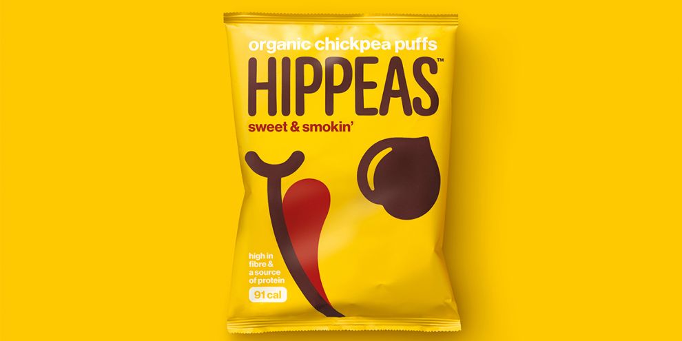
The designers at jones knowles ritchie created this fun design for a brand who clearly knows how to have a little fun; after all, they use a pun for their product name. The packaging for Hippeas is bold and unique. However, the designers were careful not to allow the pursuit of a bold design lead them into something confusing and cluttered. The Hippeas bags still have a sense of minimalism about them. At first glance, a chickpea grabs your eye. There’s also a fun image that’s a tongue licking the lips.
The packaging is also very clever with the information it presents up front and it says a lot about their target demographic. You can almost count the words of copy on your fingers. At the top we see, “organic chickpea puffs.” Organic is a huge buzzword in the food industry right now and it’s the first word on the packaging if you read it like a book. Clearly, Hippeas also wants to try and get into the shopping cart of health conscious consumers. Their calorie count is proudly displayed below the words, “high in fibre & a source of protein.”
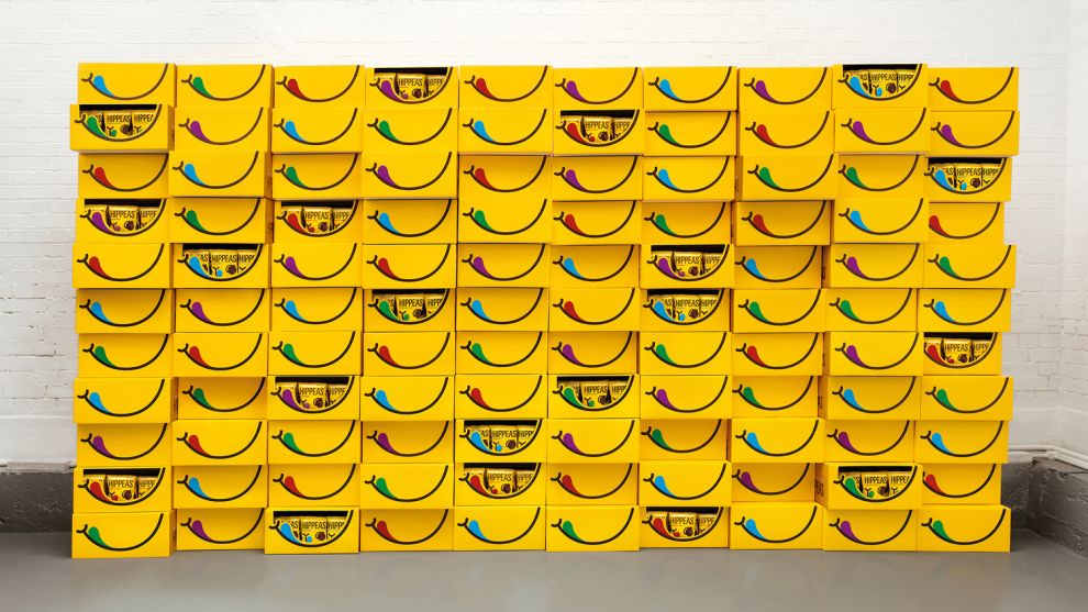
The great design with Hippeas doesn’t stop with their individual packaging. The bulk displays that would be set up at a grocery checkout counter have the familiar smile and tongue. Another great detail about this design is the color of each tongue. Certain colors correspond to certain flavors. Consumers can easily see the color and find the flavor they love. This allows Hippeas to keep their design largely uniform across all their varieties while still making it easy for shopper to pick the one they love.

Bright, bold, and simple. Those are the three words that summarize this awesome packaging design for Hippeas. Who would have thought chickpeas could look so good?
Hippeas is a bold packaging design in the Food & Beverage industry.

-preview.jpg)

