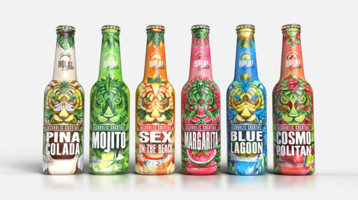
Standout Features:
- “Ferocious” design
- Uniform individuality
- Strong typography
While surprising initially, studies have shown that the so-called Zoomers drink alcohol significantly less than preceding generations. Additionally, spending “unnecessary time” on something like cocktail preparation is also far from their scope.
When designing HOLA Espirito’s packaging, AS ADVERTISING’s main focus was the reintroduction of signature cocktails to young people, in the form of ready-to-drink products. Creating a new brand that would encompass this (by using the greeting word “Holla”) was just the start.
The bottle, on the other hand, offers a ferocious preview of what’s inside them. This way consumers could effortlessly link their experiences with the packaging itself. Every single bottle is adorned with the untamed and natural exoticness of a tiger to express the refreshing metamorphosis of one’s spirit through Hola.