Standout Features:
- Minimalist design
- Nature-inspired elements
- Soft, calming color palette
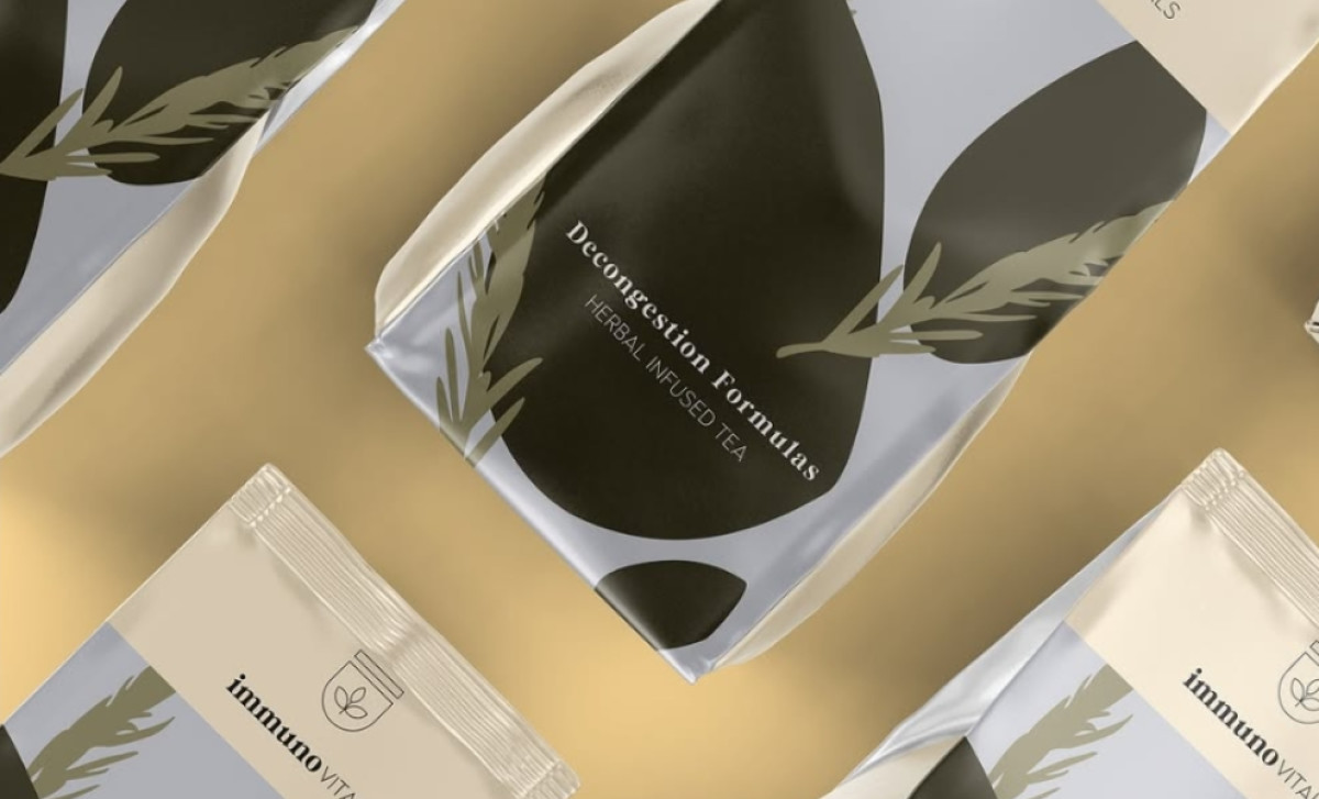
Immunovitals, a wellness brand focused on herbal-infused teas, emphasizes clean, natural, and holistic health benefits. In partnership with Form & Flow Studio, the company designed a packaging that reflects its mission of promoting health through simple yet effective solutions.
The design uses clean lines and an uncluttered aesthetic to evoke a sense of simplicity and natural purity. This not only allows the product's purpose and ingredients to shine through without unnecessary distractions, but it also aligns with the wellness and health-focused nature of the brand — all while ensuring easy recognition on shelves.
Incorporating nature-inspired elements, such as the subtle plant motifs, further reinforces the product’s herbal roots. The stylized leaf graphics are delicate and well-placed, emphasizing the organic and plant-based qualities of the tea. These design details work seamlessly to communicate the benefits of the herbal ingredients inside the packaging.
The soft, calming color palette enhances the overall calming and wellness-driven message. Pastel tones, like muted greens and soft blues, work harmoniously to evoke feelings of tranquility and relaxation — perfect for a product that focuses on improving well-being. The overall aesthetic is designed to appeal to the health-conscious consumer.
In summary, the beverage packaging design for Immunovitals by Form & Flow Studio is a thoughtful and effective representation of the brand's core values. The minimalist style, nature-inspired graphics, and calming colors work in tandem to create a compelling product that resonates with consumers looking for natural health solutions.


-preview.jpg)
