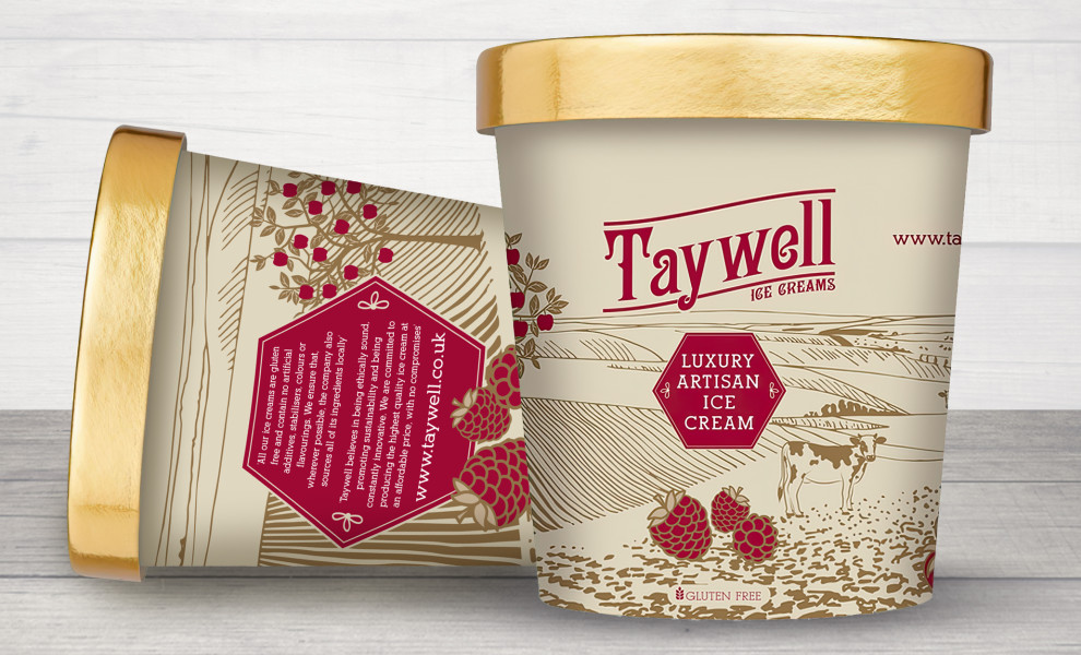
Standout Features:
- Dark red and gold as accent colors
- Tranquil countryside illustration
- Highlighted fruit drawings
Bussroot intentionally designed each element of Taywell Ice Cream’s packaging to emphasize luxury artisan indulgence. The sophisticated design uses dark red as an accent color, drawing the eye to its elegant logo and the prestigious "luxury artisan ice cream" stamp.
A tranquil countryside illustration stands as a strong reminder of the products’ locally and naturally sourced ingredients. It underscores the brand's commitment to authenticity, inviting customers to savor the genuine flavors of nature with every spoonful.
Moreover, the dark red fruit illustrations outlined with a lavish golden contour contrast against the cream background, adding to the luxury and craftsmanship of Taywell Ice Cream’s artisan-made products.
Get a chance to become the next Design Award winner.
SUBMIT YOUR DESIGN