Standout Features:
- A minimal matte-black design
- Gold typography
- A subtle color-coding system
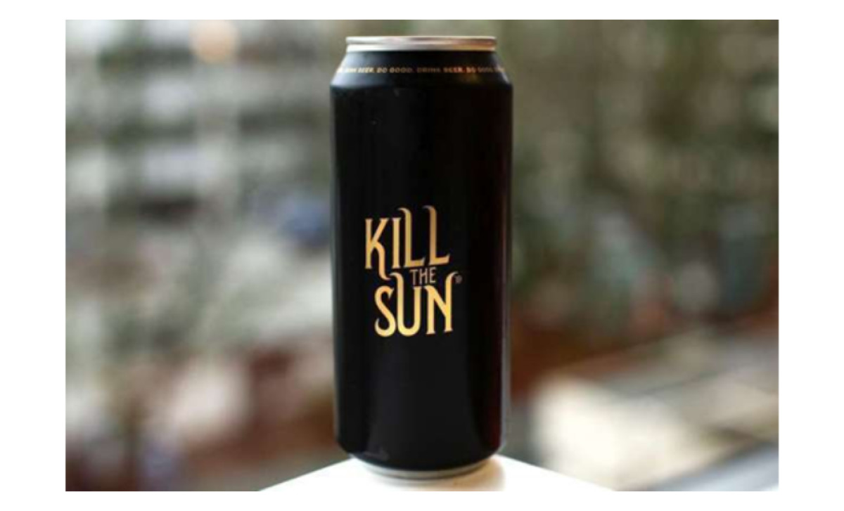
Ex Novo Brewing, in collaboration with designer Jeremy Backer, designed a beer label that doesn’t beg to be picked up. Kill The Sun simply exists, knowing full well that the right people will gravitate toward it.
There’s an intentionality to its minimalism. Instead of overwhelming the senses, it does the opposite — commanding attention through restraint. The matte black exterior, stripped of distractions, evokes the name itself — like something forged in the absence of light. The only embellishment? Gold lettering, sharp and refined.
The font choice is calculated. A classic serif typeface with elongated, slightly gothic forms, it reinforces the brand’s mystique without feeling forced. Black exudes sophistication, control, and power. The combination elevates the beer into the realm of high-end branding.
The beer label also cleverly lets the name do the heavy lifting. Kill The Sun — a phrase that instantly evokes something dark, something powerful, something beyond the ordinary. The stark, high-contrast branding reinforces the message, making it feel more like an artifact than a mere beverage container. It’s beer branding that understands the power of restraint.
While all three versions (Classic, Mocha, and Horchata) stick to the same matte black and gold motif, each one incorporates minor visual tweaks to distinguish itself. The differences are subtle: a slight shift in hue, a delicate accent, a coded design element that maintains the beer’s elegant, restrained aesthetic.
Despite its subdued nature, Kill the Sun manages to stand out in a market saturated with hyper-designed craft beer packaging. It’s proof that sometimes, the best way to get noticed is not to shout but to speak with confidence. Sometimes, darkness, quite literally, steals the spotlight.