Standout Features:
- Location-inspired illustrative can art for each beer
- Modern craft brewery logo system with a nature mark
- Vertical typographic lockups
The visual identity for Unmapped Brewing Co., by Liina & Co., reflects the brand’s dual spirit of adventure and discovery. Based in Minnesota, the craft brewery's packaging is fresh and expressive. Each can is a tiny travelogue, designed to connect the beer to the inspiring terrain behind its creation.
This emphasis on creating an eye-catching design is a powerful driver for acquiring new customers, as research shows 81% of consumers have tried a new product simply because the packaging appealed to them.
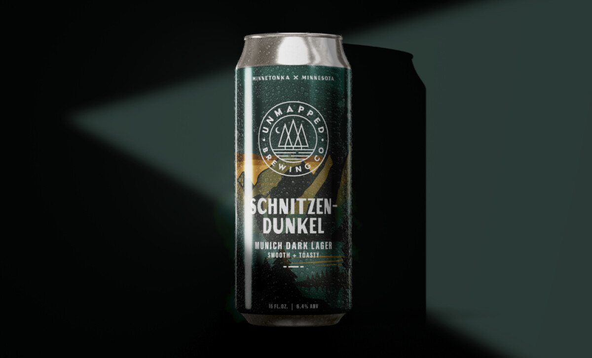
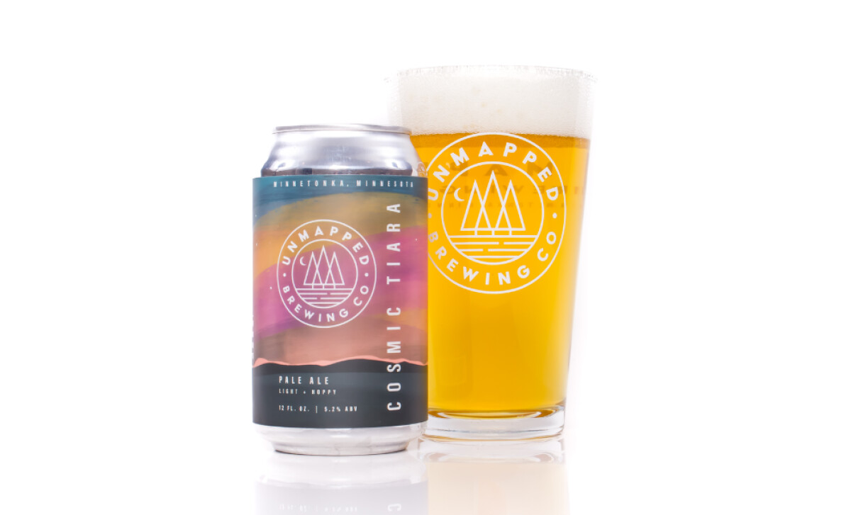
The custom, location-inspired illustrations are a standout. A dark, moody alpine design for "Schnitzen-Dunkel" contrasts with a vibrant sunset look for "No Trace IPA." This strategy personalizes each beer, with the artwork’s mood tethered to the flavor profile, rewarding repeat customers with collectible designs.
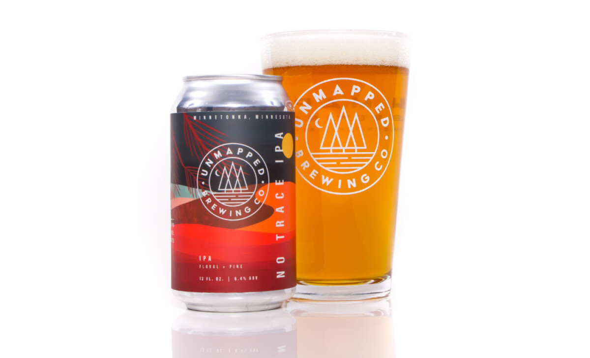
All cans prominently feature the circular Unmapped Brewing Co. badge, which shows three stylized pine trees over a horizon line. Its simplicity aligns with modern craft beer sensibilities while also evoking state park signage, grounding the brand in outdoor authenticity.
Beer names such as “NO TRACE IPA” are presented in vertical type treatments. Set in clean, sans-serif caps along the can's edge, these vertical locks are a significant design choice. They stand out in retail environments where horizontal typography dominates.
Ultimately, the thoughtful integration of place-based illustration, a modern logo, and dynamic typography results in one of the best beverage packaging designs that speaks of adventure and quality.

-preview.jpg)