Team Behind the Design
Packaging Design Analysis
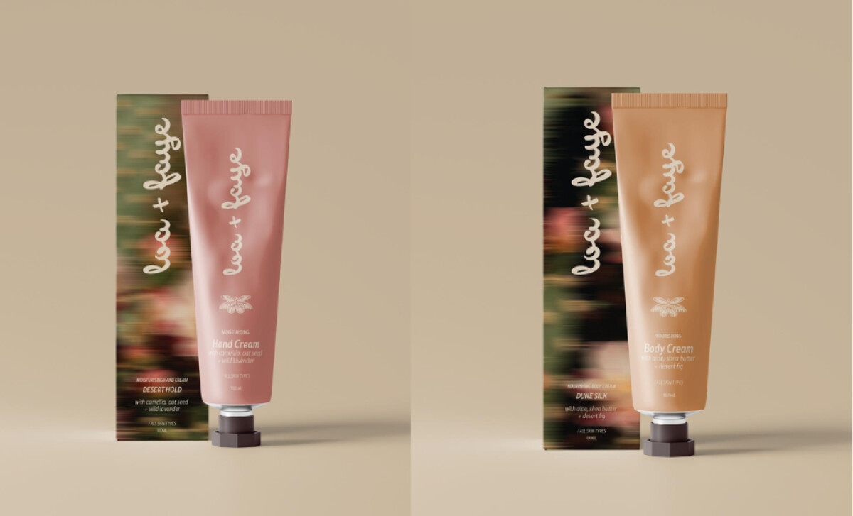
When I review skincare packaging, I look at structural design, visual storytelling, typography, and how well the product reflects brand values.
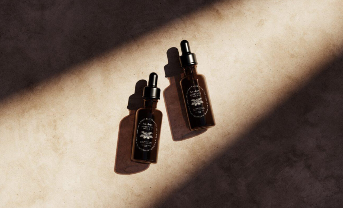
Joanne Anson’s work for Loa + Faye captures these elements beautifully.
- Structure: I like how the clean glass dropper bottles and minimal tubes highlight function while allowing the brand’s ethos to take center stage.
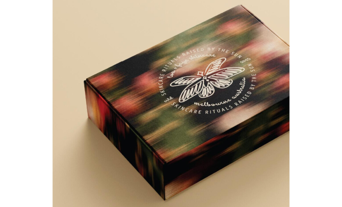
- Shelf Impact: The blurred desert-inspired textures on secondary packaging create a unique, atmospheric presence that sets the brand apart in beauty aisles.
- Information Hierarchy: Typography is soft yet legible, ensuring product details are accessible while maintaining a meditative aesthetic.
- Sustainability & Storytelling: The design feels rooted in natural rhythms, encouraging a slower, more mindful approach to beauty, which align with eco-conscious values.
What Brands & Agencies Can Learn from Loa + Faye
This skincare packaging design shows how texture and typography can create a calm, meditative brand presence.
1. Use Atmospheric Textures
You can create a distinct mood for your product by using an abstract, nature-inspired graphic on its outer box. This textural element can make your packaging memorable on a crowded shelf.
2. Keep Containers Simple
A clean, unadorned bottle or tube can place all of the focus on the quality of the product inside.
3. Set a Typographic Mood
Your font choice is a powerful tool. A typeface with soft edges can help create a quiet, gentle personality for your product. This decision contributes to the overall feeling without sacrificing legibility.
About DesignRush Featured Designs
The designs we feature showcase leading creativity and expert delivery. Each stands out for its originality, precision, and ability to move brands forward.
The very best among them are celebrated through the Monthly Design Awards.
The best skincare packaging designs emphasize shelf presence and storytelling. Explore more:
- Best Packaging Designs
- Best Website Designs
- Best App Designs
- Best Logo Designs
- Best Print Designs
- Best Video Designs
For a full list of design agencies and related services, see our Agency Directory.