


- Agency: Cromia Design
- Client: Lumere
- Category: Packaging Design — Beauty & Fashion
- Location: Sarzana, Italy
- Project Brief: Design packaging that enhances shelf appeal and communicates Lumere’s botanical skincare philosophy through minimalism.
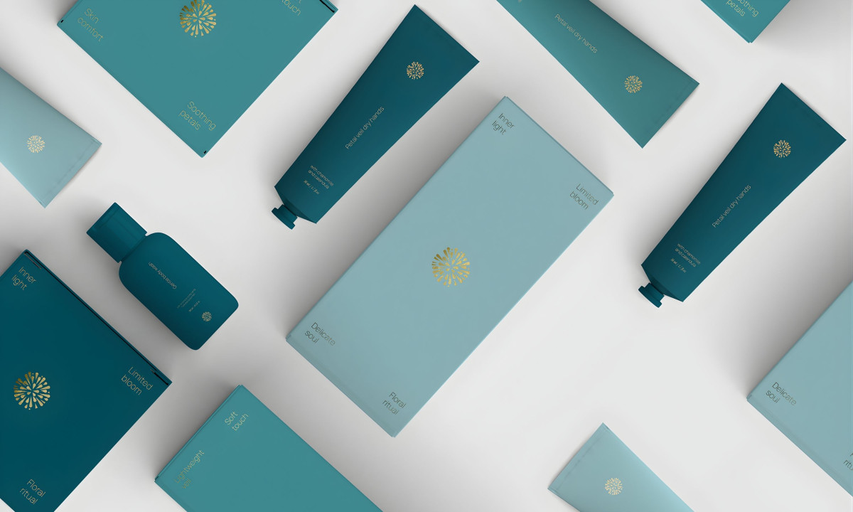
Fashion and beauty packaging rarely succeeds through loudness. The brands that hold shelf presence over time tend to build it through restraint, material honesty, and a clear point of view. Cromia Design's work for Lumere, a botanical skincare line, takes restraint seriously. Every surface decision here earns its place.
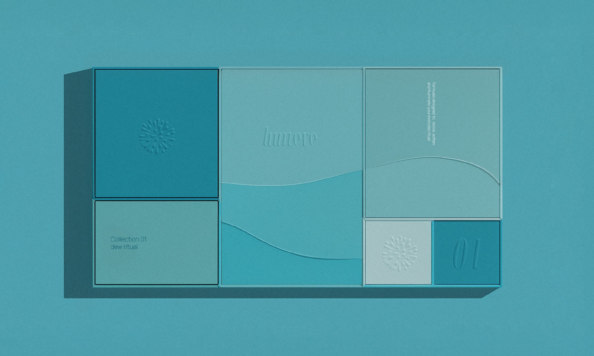
Lumere centers its identity on flowers, light, and everyday rituals. The packaging translates that philosophy into a calm visual system built on soft tones, refined details, and a consistent logic across the full product range.
Structure gives the line its backbone. Clean geometric forms across the boxes, tubes, and bottles read as stable and controlled, with no surface detail working harder than it needs to.
Shelf impact comes from tone rather than contrast. Soft blue gradients paired with gold foil accents create a presence that registers subtly from a distance: the kind of restraint that ages well in a retail environment.
Typography stays minimal and deliberately spaced. Product names and variants remain easy to scan without competing for attention.
Material and finish complete the experience. Matte surfaces and velvety textures give the packaging a sensory quality that aligns with the brand's focus on care and daily ritual, making the physical object feel like part of the product itself.