Standout Features:
- Boxed ice cream pints
- Light-colored packaging materials
- Clean and simple ice cream cups
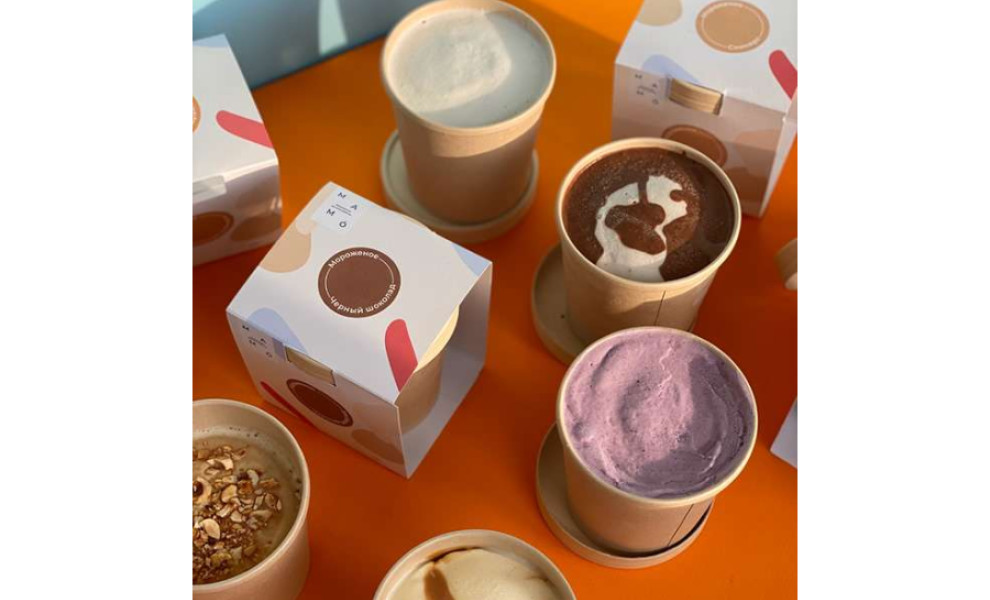
Mamó is a Ukrainian brand that serves delectable ice cream and refreshing drinks. With the varied set of packaging presentations that Lida Brian designed for this brand, customers are sure to get their ice cream options in ways more than one.
First, the treats are showcased in that typical single-serve pint. What makes it extraordinary, though, is the outer frame.
Aside from the pint, the product is also slipped into an open-sided box. Knowing that ice cream containers can be too cold to carry, having this extra layer of packaging delivers a more user-friendly experience for to-go orders. It also adds a premium feel to the ice cream. And it just simply looks great!
For in-store customers, they can get their scoops in printed cups with the logo. Just like the pints, they have minimal styling which only includes the brand name at the center to make the flavors shine.
All the materials are painted in a light beige color, a good way to keep things streamlined. It’s also the perfect neutral tone for some of the visual elements that come in a handful of colors. Instead of using realistic images and graphic illustrations, the designer opted for shapes and outlines for a more sleek and simple design.