Standout Features:
- Playful typography
- Blue and white color story
- Easy-open jar
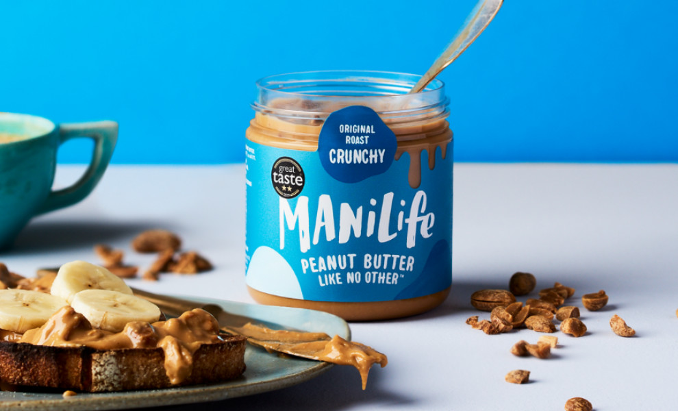
The Manilife spread packaging design by Elisabetta Giordana Design is a delightful blend of simplicity, boldness, and functionality.
Playful typography catches the eye, creating a sense of fun and excitement around the product. The font choices are visually appealing and easy to read, ensuring the brand name and product information stand out.
The product's rich and thick texture in the jar is complemented by an equally rich blue and white color palette in the label design. It features the brand name front and center, a seal of "great taste" approval, and some of the product's key attributes in a darker shade of blue that says, "Original, Roast, Crunchy."
An easy-open jar design prioritizes convenience and user experience. The simple twist-off lid ensures that customers can effortlessly access the product, enhancing their enjoyment.
-preview.jpg)