Standout Features:
- Elegant, high-end aesthetic
- Logo-integrated design
- Refined color palette distinguishing product variations
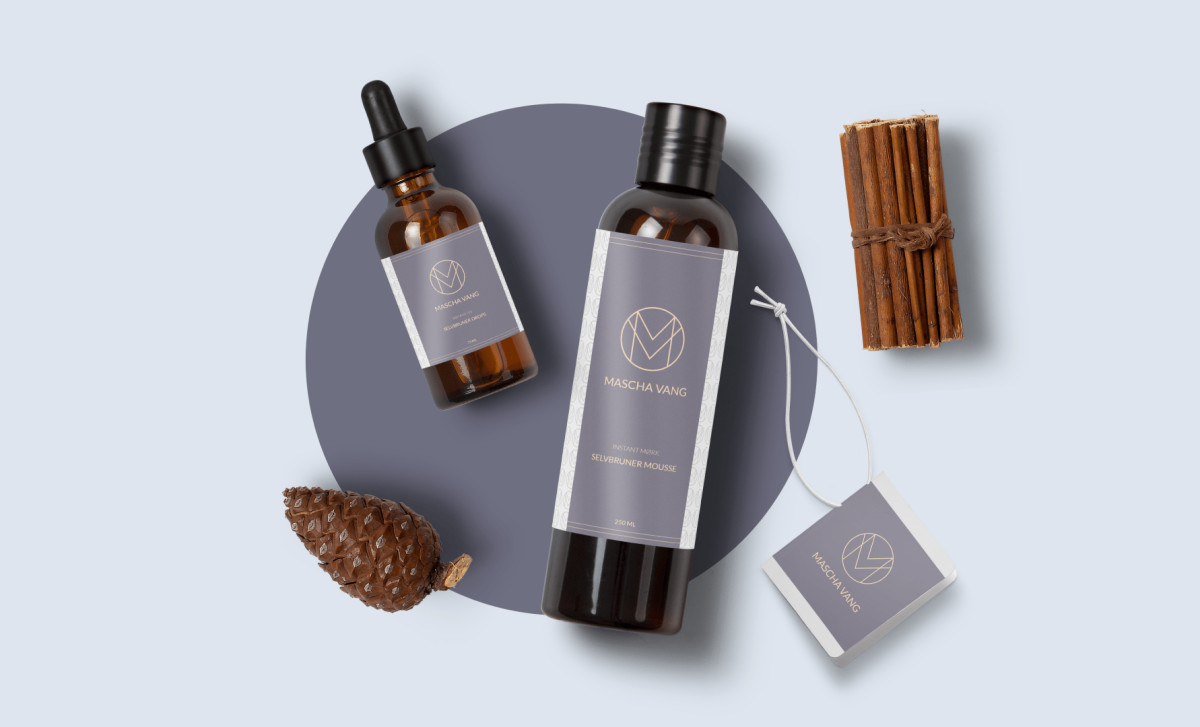
Mascha Vang’s beauty brand exudes luxury, and its packaging design by KAY Studio reflects this through a dual-narrative concept. The design captures Mascha Vang’s multifaceted identity while staying true to her brand DNA and ideal customer profile. This thoughtful approach enhances brand authenticity and resonates deeply with her 350,000+ followers.
The high-end aesthetic is immediately evident, with sleek typography, clean layouts, and subtle branding elements that exude sophistication. The minimalist approach eliminates unnecessary distractions, keeping the focus on the product and its quality.
A defining feature of this packaging design is its logo-integrated approach, where the refined "M" and "V" initials form a timeless, feminine emblem. The logo becomes an integral part of the packaging itself, reinforcing the brand’s elegance and making each product feel like an extension of Mascha Vang’s personal brand.
A refined color palette plays a key role in differentiating product variations. For example, the light lavender-gray theme suggests softness and natural ingredients. This contrast ensures clear product segmentation while maintaining a cohesive brand identity.
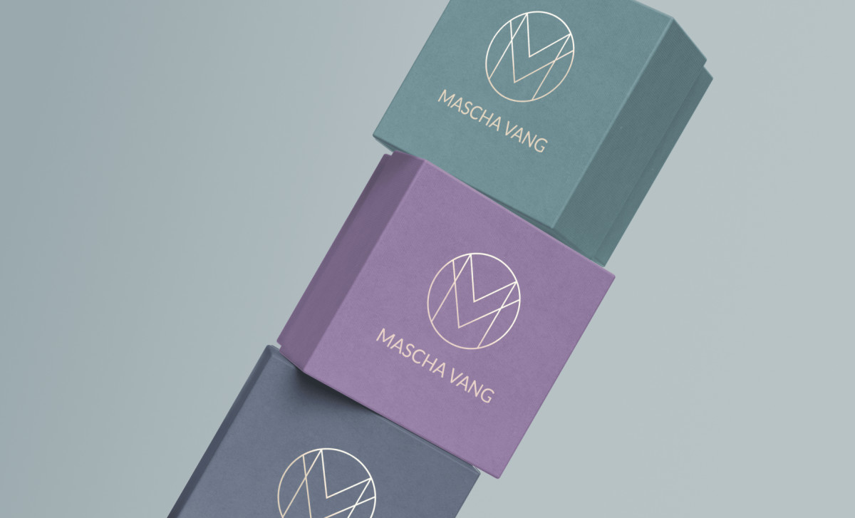
Mascha Vang’s fashion and beauty packaging design seamlessly blends sophisticated visuals with premium materials, reinforcing the brand’s status in the beauty industry. The refined design captures the essence of luxury skincare, making each product feel like an indulgent experience.