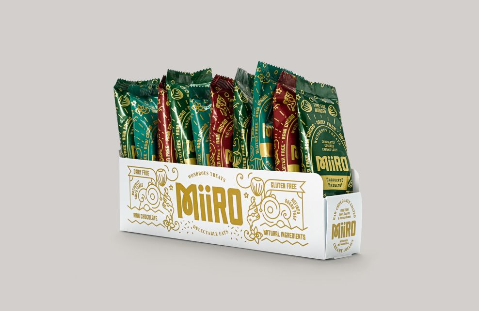
This packaging was created by I Want Design for a Pure & Co's new product: A healthy ice cream, which contains everything natural and is gluten- and dairy-free. The brand didn't start with a name or a look, so the agency created this look from scratch. The beautiful patterns and design elements align well with the chosen name: In Latin, Miiro means "to wonder."
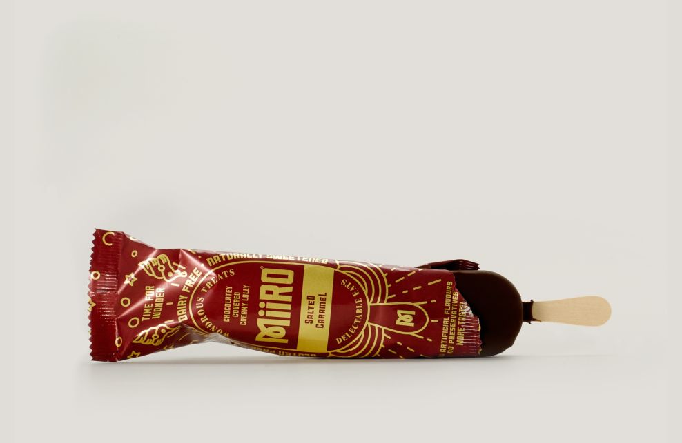
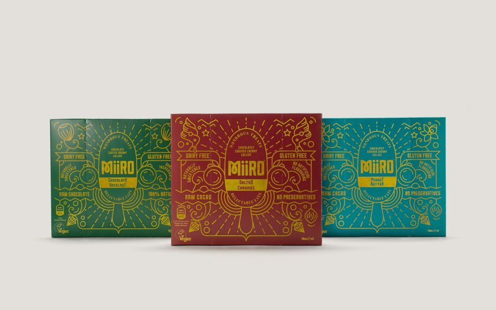
The sober colors and golden accents tell users that this gourmet product is meant for peple lookiing for the best of the best.
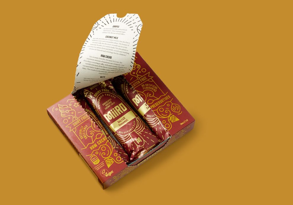
Although this product is super healthy and made for vegans and vegetarians, the sleek and chic design allows the product to supercede that and appear much trendier.
The halos, light rays, and other elements create a dreamy atmosphere that transport users to a pleasant place with their ice cream.
Miiro is an elegant packaging design in the Food & Beverage industry.


-preview.jpg)