- Article by
- Lensey Etcubañas

#3276BD #F58AB4 #FFFFFF #3F2915
- Agency: CAPS Design Studio
- Client: MILK'ISH
- Category: Packaging Design — Food and Beverage
- Project Brief: Build a brand identity and packaging system for a plant-based milk line that stands apart from a homogeneous alternative dairy market.
Plant-based packaging lives or dies by one decision: whether the brand feels honest or just wholesome-washed. The shelves are full of clean white cartons, earthy photography, and nature-forward type, all signaling purity without personality. MILK'ISH needed a different answer.
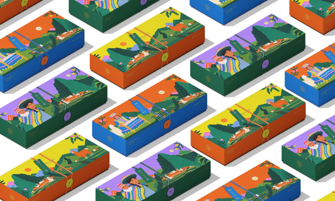
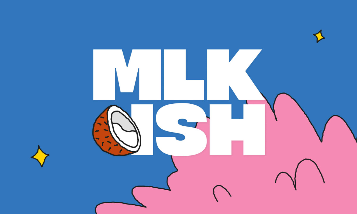
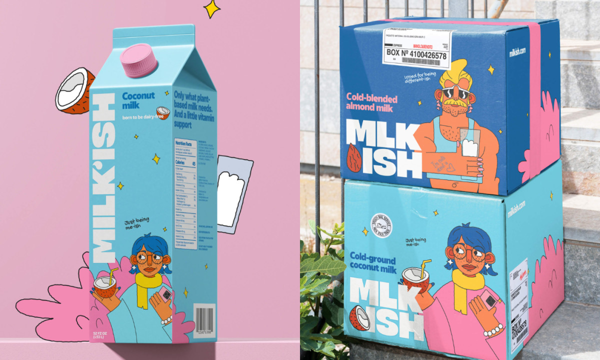
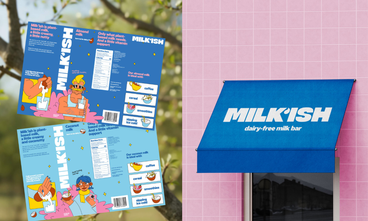
CAPS Studio's MILK'ISH leans into imperfection as a feature. The wordmark itself signals it, that apostrophe isn't a typo, it's a declaration. The visual language follows: soft, warm palettes built from creams and oat golds, illustration that feels hand-made rather than rendered, and original mascot characters that anchor each SKU with a distinct personality. The style doesn't borrow from wellness or premium minimalism. It sits closer to a children's book illustration crossed with indie food branding.
The mascot system is the structural decision that makes the line work. Each variant gets its own character, different enough to signal flavor, consistent enough to read as a family on shelf. New product means new character. The identity scales without reinvention.
MILK'ISH becomes a brand you recognize before you read the label, and that's exactly the register a crowded category demands.
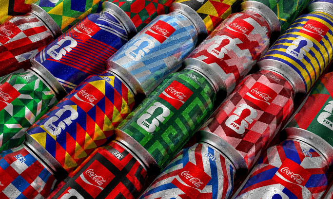
Coca-Cola FIFA World Cup 26 Collectible Country Cans
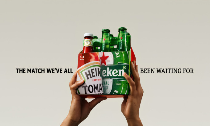
HEINZ x Heineken® Limited Edition Six-Pack
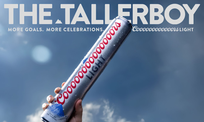
Coors Light Tallerboy
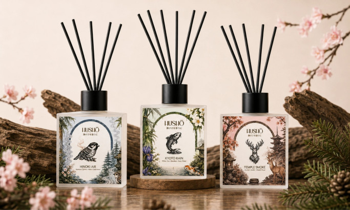
Hushō

Mật Mã Gift Set

I AM ITALIANO