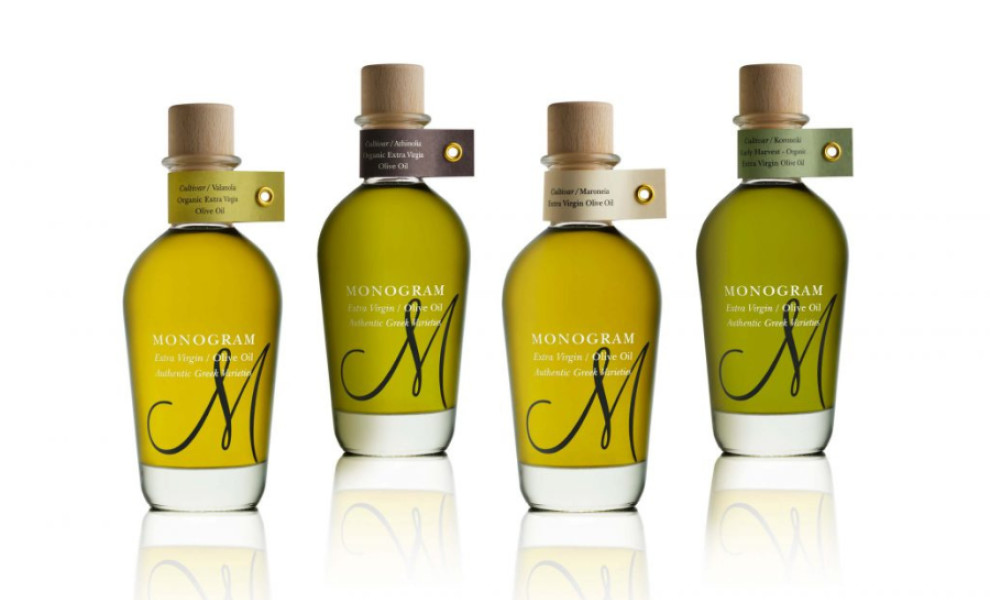
Standout Features:
- Color-coded
- Labels on bottlenecks
- Elegant design
DKD STUDIO's packaging design for Monovarietal Olive Oil is all about harmony and simplicity, emphasizing the product's well-balanced flavor. The color-coded boxes and labels make it easier for consumers to distinguish between variants on market shelves.
Another distinctive feature of this packaging design is the labeled bottlenecks, which add elegance while making the bottles easily recognizable. The label placement leaves the bottle's body uncovered, allowing the rich color of the olive oil to be the focal point, emphasizing its quality and allure.
The outer packaging includes the cultivar type, origin, harvest period, processing method, and tasting notes. This approach underscores the brand's commitment to transparency, communicating the care and process involved in producing the olive oil and assuring consumers of its authenticity and premium quality.