Team Behind the Design
Packaging Design Analysis
Packaging design in the food and beverage space must have the following:
- balance
- clarity
- storytelling
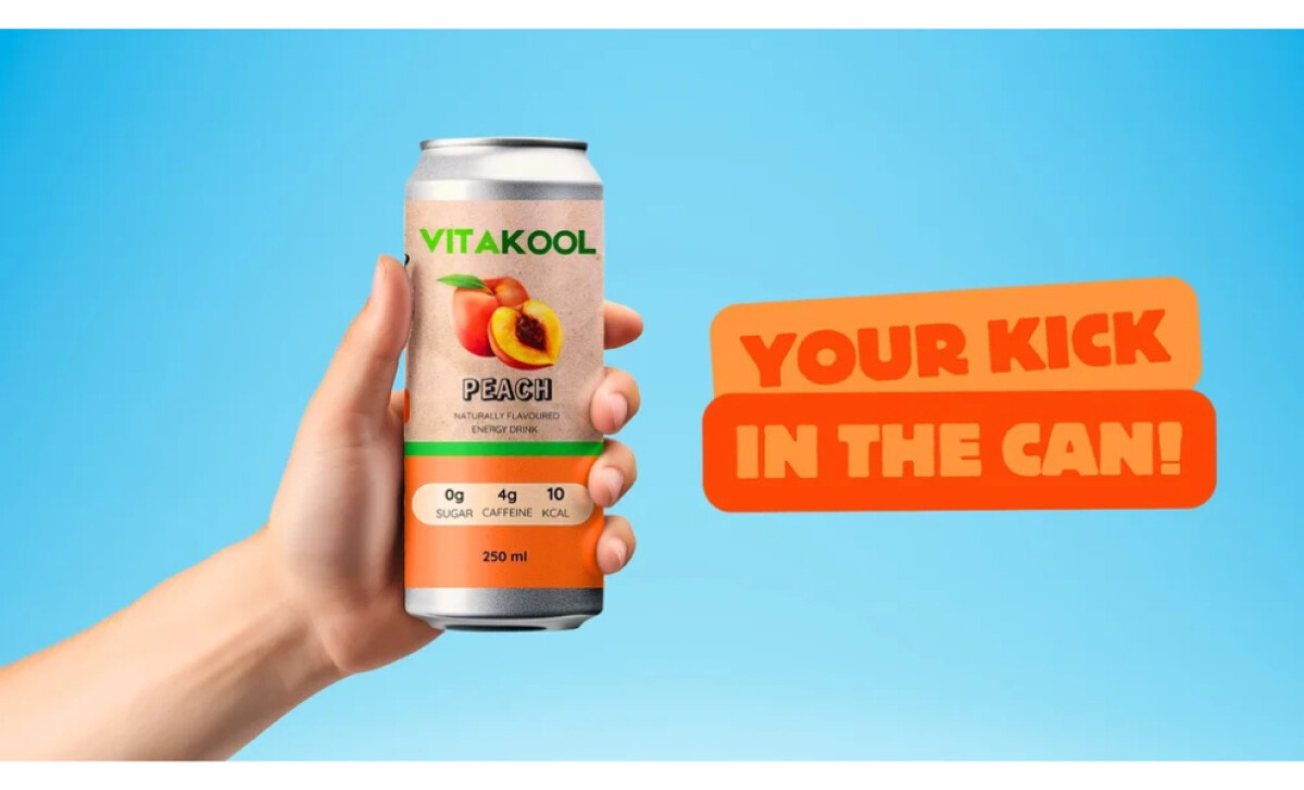
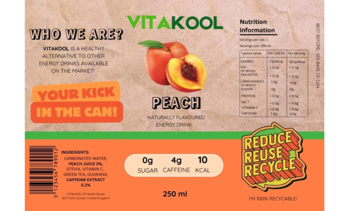
The can design for Vitakool accomplishes this through natural tones, clear structure, and strong alignment with the brand’s values.
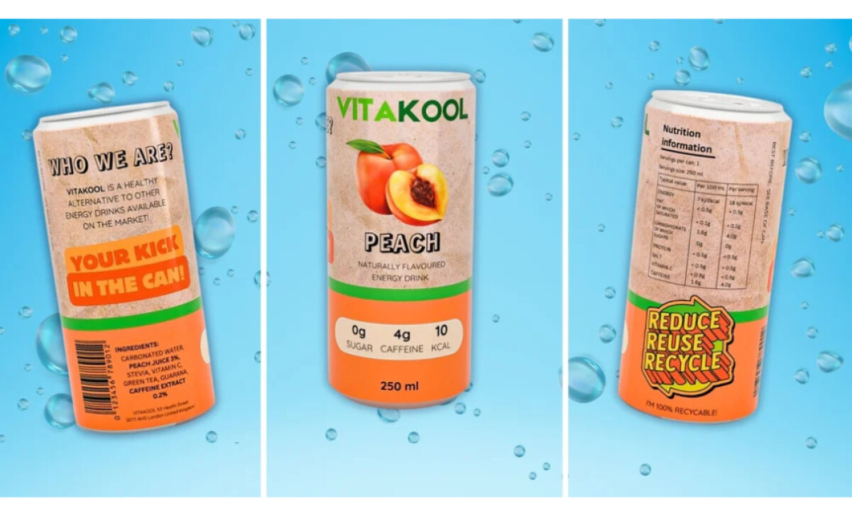
- Structure & Function: The compact 250ml aluminum can is practical for transport and storage. I like how it communicates sustainability while staying lightweight and easy to recycle.
- Color & Imagery: Shades of brown, green, and peach instantly evoke freshness and nature. The central peach graphic feels inviting and helps identify the flavor at a glance.
- Typography: The rounded sans serif paired with a shadowed display type creates rhythm and contrast. This pairing keeps the information easy to read while adding an energetic touch.
- Information Layout: The front panel communicates clearly, with “low caffeine,” “zero sugar,” and “low calorie” placed where the eye naturally lands. I like how the layout organizes essential details without clutter, giving the design a sense of honesty. Even the recycling artwork and nutrition cues feel considered, reinforcing transparency and consumer trust.
What Brands & Agencies Can Learn from Vitakool
Vitakool’s packaging shows how thoughtful design choices can communicate freshness, health, and responsibility in a single glance.
1. Let Materials Reflect Values
Use packaging formats that support the brand’s message. A lightweight, recyclable can signals environmental awareness while staying functional for everyday use.
2. Use Color to Convey Freshness
Incorporate natural tones and soft contrasts to evoke wellness and flavor. Color should feel authentic to the product, guiding expectations before purchase.
3. Keep Information Clear and Honest
Highlight key product details upfront so consumers can make quick, confident choices. Transparency in labeling builds trust and strengthens brand credibility.
About DesignRush Featured Designs
At DesignRush, we review hundreds of agency projects every month. Packaging designs like Vitakool’s stand out for their balance of concept, function, and presentation.
The most compelling projects often advance to our Monthly Design Awards, celebrating outstanding creativity in design.
Packaging design in the beverage industry often shows how color, typography, and structure can tell a story of health and freshness. Explore more inspiring examples here:
- Best Packaging Designs
- Best Website Designs
- Best App Designs
- Best Logo Designs
- Best Print Designs
- Best Video Designs
For a full list of design agencies and related services, see our Agency Directory.
-preview.jpg)