Standout Features:
- Hand-drawn animal illustrations
- Pastel color-coded product system
- Clean, parent-friendly layout
Supersmak Design Studio brings visual delight and brand clarity to NAIF’s baby care product line. Designed with both playfulness and trust in mind, the packaging design immediately appeals to health-conscious parents and curious little ones alike.
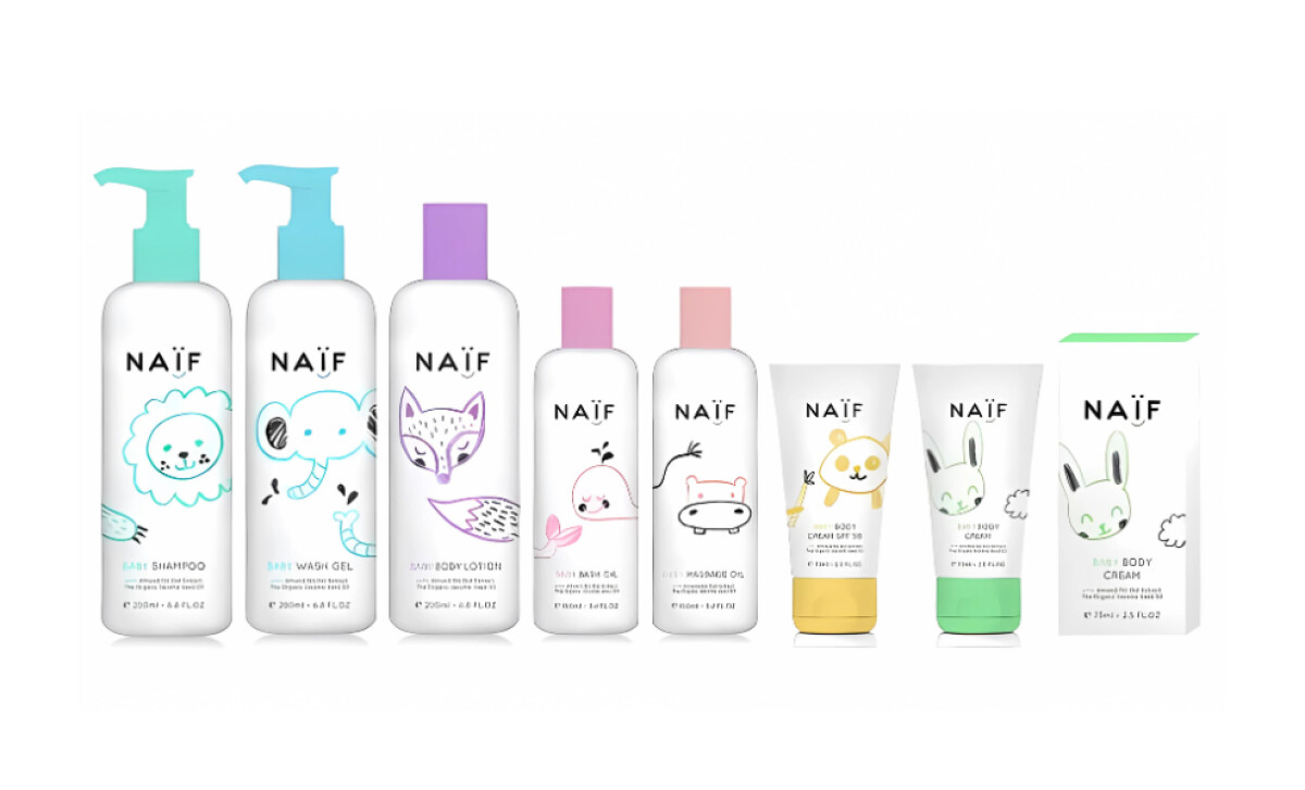
Each product features a unique, hand-sketched animal illustration — from a smiling lion to a snuggly panda — that serves both as a visual cue and emotional anchor. The art style is intentionally childlike yet precise, inviting without feeling overly commercial.
To distinguish between product types, Supersmak applies a soft, pastel-coded color system — teal for shampoo, lavender for lotion, yellow for SPF cream. This makes identification intuitive for busy parents and reinforces the product's clean, non-toxic positioning.
The type layout is clean and legible, favoring generous white space and soft sans-serif fonts. There’s no visual clutter, just clear hierarchy that lets ingredients and benefits stand out.
NAÏF’s packaging is what happens when design meets empathy. Supersmak has crafted a suite that builds trust on the retail shelves with charm and clarity.