Standout features:
- Expressive graphics
- Welcoming shades for the color profile
- Unassuming typography
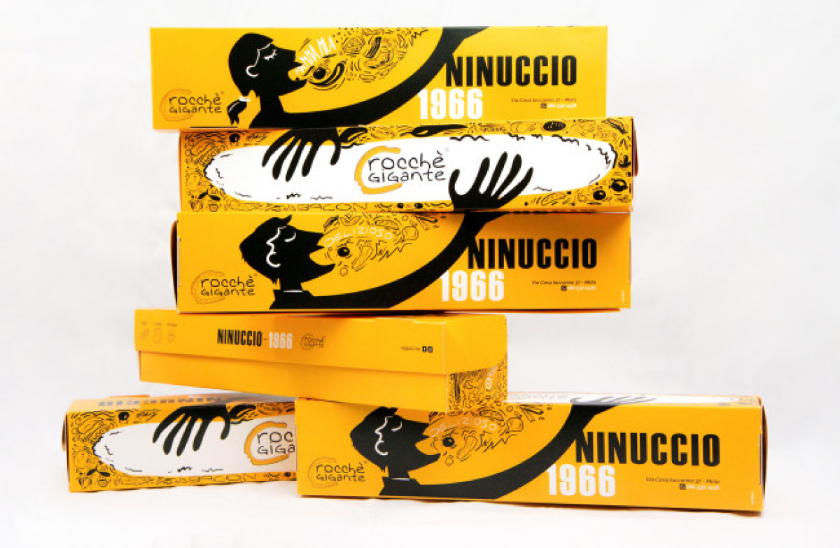
Ninuccio's cardboard packaging design is one prime example of how fun can be injected as a part of one's brand identity and succeeds in making people smile and react to it. Ninuccio's overall aesthetic appeals more to the youth, and this cardboard packaging design supports that goal.
SoCity is an Italian company that also operates in the UK and France. This great cardboard packaging design they made for Ninuccio succeeds in preserving what the brand is as a personality and adding more elements that complement each other very well.
The first thing that catches your eye is the impeccable graphics that instantly transport you to the colorful murals of Mexico City. The Latin flair is unmistakable, adding another character to the design as something dynamic yet not too exhausting to watch.
This design has a flair that everybody loves! No one wants boring, old cardboard packaging, anyway. Stacking the boxes together would form a bigger picture -- great for product presentation.
Also, the clear and simple fonts help balance the energetic display of graphic design throughout the cardboard packaging.
Lastly, the designers used a color of joy and celebration: Yellow. It’s the perfect shade for the brand!

-preview.jpg)

