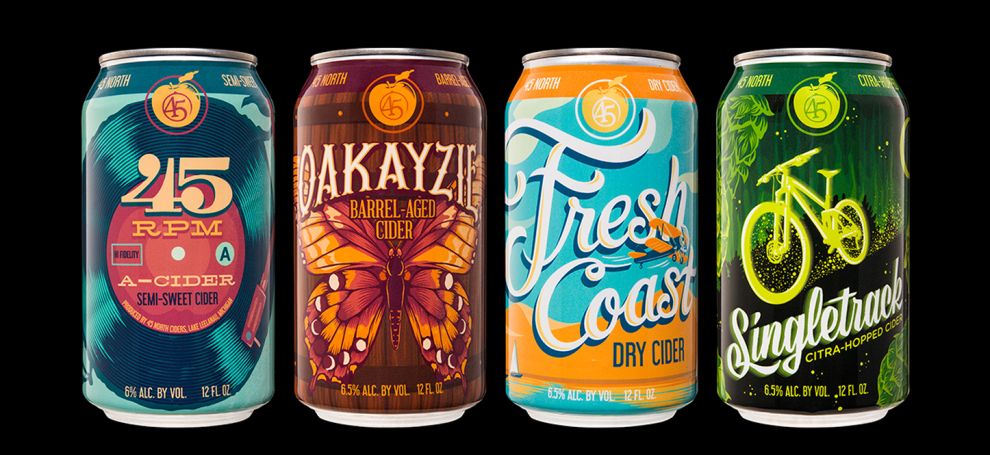
The best packaging designs in the world engage the consumer by standing out on the shelf. They communicate product details in a clear manner. This example of the best packaging design was created by Hired Guns Creative for 45 North Vineyard & Winery’s cider line.

Allow me the honor of breaking down what makes this package design amazing. First, the best packaging designs engage the consumer by standing out and making an impact on store shelves.
Hired Guns used 45 North’s customer data to develop a poster theme featuring headlining acts at the same music festival.
Look at this typography. It is art. The typography is clear and unique. The 45 RPM cider has a theme of vintage vinyl. A tree trunk crafted into a turntable. The rings and the record grooves, delivering wonderous music into the air.
This catches consumers' attention.

The Oakayzie design features an iconic butterfly that emerges from an old wooden oak barrel. The wings are inspired by the lunar phases and resonate with its theme, which is the passage of time
The color contrasting is a visual masterpiece. Color contrasting sucks in consumer attention like a Dyson vacuum.

The Fresh Coast Dry Cider highlights different shades of blue with orange. A gorgeous color contrasting choice. The theme here is the laidback landscape of Michigan’s middle coast. A propeller plain glides through and adds the cherry-on-top to complete the design.
The cursive typography flows with the coast theme like a propeller plane coasts through the air.
Like the green turtle in Finding Nemo coasts on the gulf stream: “Righteous, Righteous!”
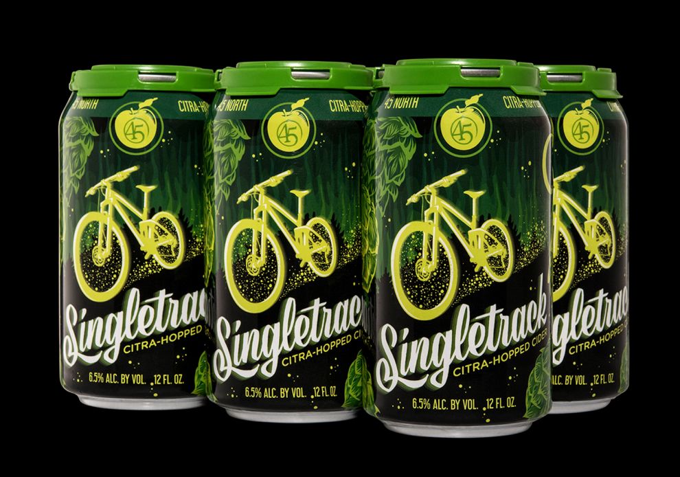
The Singleton brew looks amazing with white text popping out from the green and black futuristic background. The lime theme bursts with citrus color tones and communicates the message of an incoming citrus flavor explosion.
The bike looks grand and glow-in-the-dark, like it resides in some sort of futuristic dystopia of exploration. The font is a ravishing cursive that should also serve as the artist’s autograph for creating a design that stands out.
The best feature of this packaging design is the overall theme is unified and cohesive. Each can is different but connects together back to the central theme of music posters. The best packaging designs in the world stand out from the store shelf. It has to be seen. It has to engage. To accomplish this you must provide visual eye candy.
Make the packaging design unique. Use outstanding typography. Know your audience. Hired Guns knows that this target audience is creative and loves music. They sell a lot of their products at music festivals. The music poster theme resonates with them. They will feel an emotional connection to the product. They will relate.
And when the consumer relates to the product, and their interests and values align, they feel comfortable. And feeling comfortable results in the sale.
Unleash your creativity with awesome typography and color contrast, and your packaging design will be among the best in the world.
North Vineyard Winery is a bright package design in the Food & Beverage industry.