- Home
- Best Designs
- Best Packaging Designs
- Nuspalvink Diena candle design
- Advertising
- Agriculture
- Arts & Recreation
- Automotive
- Bread
- Candy
- Chocolate
- Condiment
- Content & News
- Dairy Product
- E-Commerce & Retail
- Eco and Sustainable
- Engineering
- Entertainment
- Fashion & Beauty
- Food & Beverage
- Frozen Food
- Health & Wellness
- Honey
- Hospitality
- Jewelry
- Luxury
- Manufacturing
- Medical & Pharmacy
- Medicine
- Non-Profit
- Nut
- Olive Oil
- Pet Food
- Professional Services
- Skincare
- Soap
- Spirit
- Sports & Leisure
- Technology
- Toys and Games
- Travel
- Watch Branding
- Wine
Nuspalvink Diena candle design
- Packaging designed by Monika Sim
- 165
Standout Features:
- Ornate logo design
- Bold serif fonts
- Calm color story
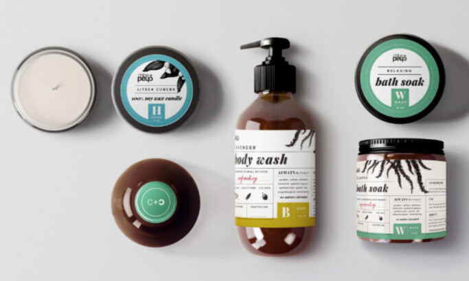
Monika Sim Studio’s candle label design for Nuspalvink Diena candle design features an ornate logo that looks like a chrysanthemum, symbolizing the fall and calmness in Japan. It is also associated with the royal family.
The agency unites these symbolisms with the brand’s vision of providing its customers with a tranquil experience through high-quality candles.
The bold serif fonts for the product labels and descriptions are excellent touches to the design, encouraging people to sink into feelings of peace.
Tying all these elements together is green, a calming color that reinforces the desired laidback vibe.
Get a chance to become the next Design Award winner.
SUBMIT YOUR DESIGN- Packaging designed by Monika Sim
- 165
- Tags:Candle Label
More Best Packaging Designs
Sign Up for Our Newsletter
Receive the Latest Digital Trends &