Standout Features:
- Red, hot, chili red color
- Prominent logo
- An array of different packaging options
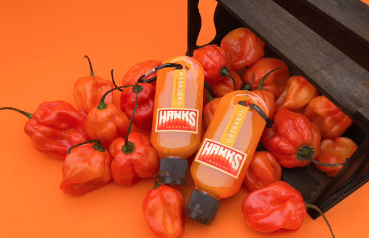
Hawks Hot Sauce is a product-based company that, surprise, surprise, produces and sells small batches of delicious hot sauce to enthusiasts who enjoy hot, yet flavorful, foods and sauces. "Some like it hot" if you will.
The packaging, courtesy of Stefanie Cobb sets itself apart from the sea of novelty hot sauce brands that flood the market with a nice visual blend of tradition and efficiency. It emphasizes the brand's focus on quality and flavor.
What makes it stand out, however, is the sheer packaging variety. Besides your typical, slap-it-on-the-bottom hot sauce bottle and eye-pleasing label, Stefanie introduces an interesting take on the tactical container. used by professional hikers and service members. This solution helps Hawks position itself not simply as a scorching addition to your meal but as its bare necessity.
Alas, we all need sauce keychains and sauce packs (designed as business cards) for those emergency hot sauce situations.
-preview.jpg)


-preview.jpg)
-preview.jpg)
