Standout Features:
- Bold color blocking for clear product differentiation
- Simplified, iconographic animal silhouettes
- Clean typography with strong hierarchical labeling
This packaging redesign for Pearson Animal Health, a veteran in Brazil's veterinary market, comes at an exciting time for the company. With new product lines and a focus on tech, Inventives Creative Boutique helped them create a modern look. It’s a visual system you’ll find appeals to professionals and consumers alike with its clarity.
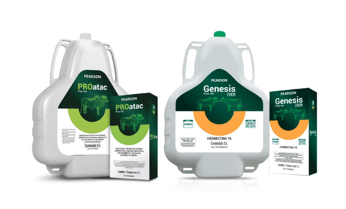
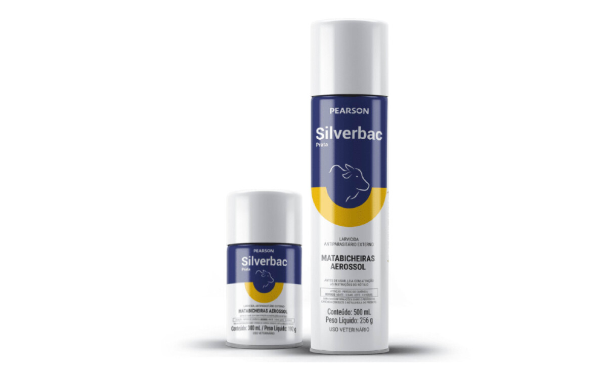
The designers used a clever system of bold color blocking, with each category getting its own specific color — like rich green for PROatac or bright orange for TacPlus. Given that 85% of shoppers cite color as a key reason for their purchasing decisions, this energetic system is also crucial for helping consumers and vets easily identify the right product.
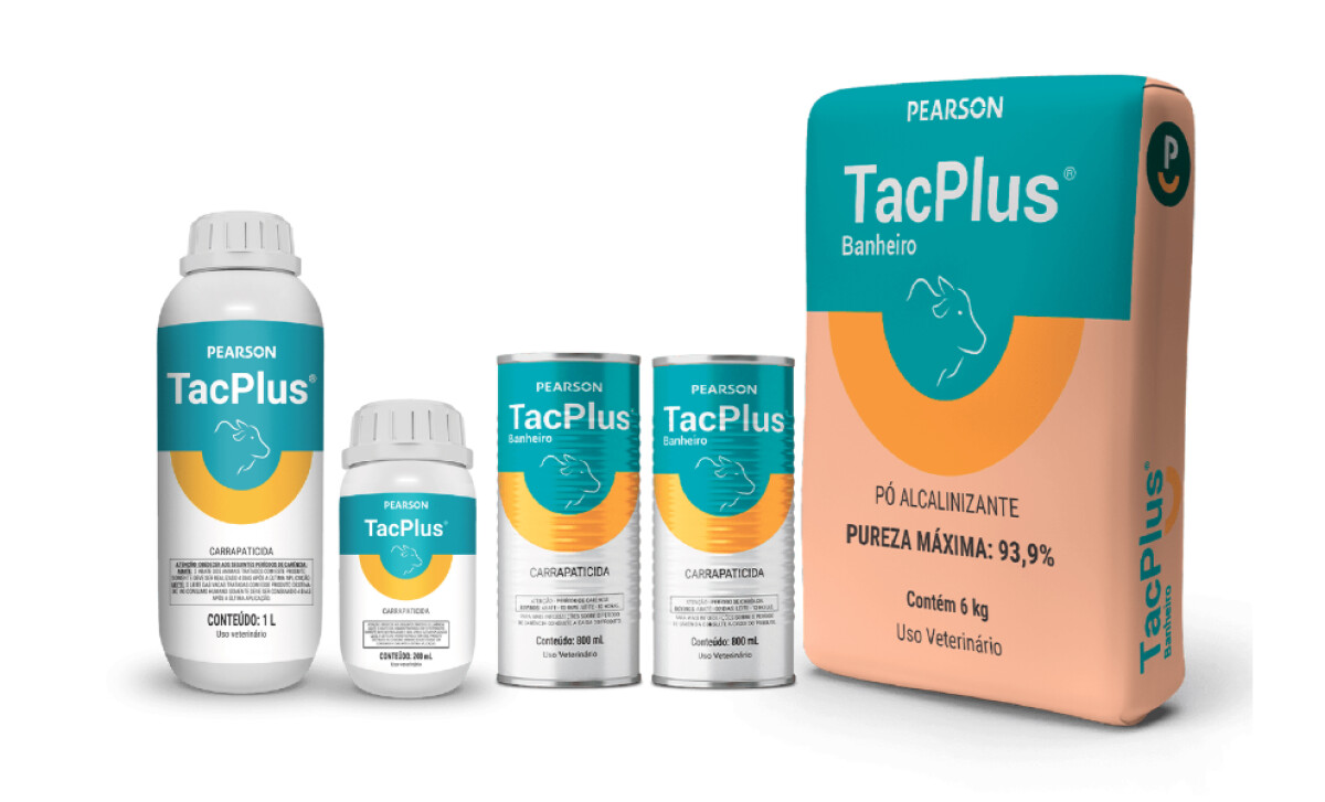
Additionally, each package features a minimalist outline of the animal it's meant for — you might see a cow or a sheep. These subtle, single-color icons are placed within the main color block. This makes it instantly clear which animal the product targets, which is super helpful when consumers are in a hurry.
The text on the packaging is also very clear and easy to read. They use a modern sans-serif font. Product names are big and bold, so you see them first. Then, other important details like dosage are in smaller, neat text. This makes all the information accessible.
What you see with Pearson's new retail packaging is a design that’s both visually striking and incredibly practical. The color-coding, animal silhouettes, and clear labeling help you make informed choices. This work effectively enhances Pearson's brand visibility and strengthens its consumers' confidence in its products.