Standout Features:
- Two-toned color palette
- Mix of traditional and modern design elements
- Character illustrations
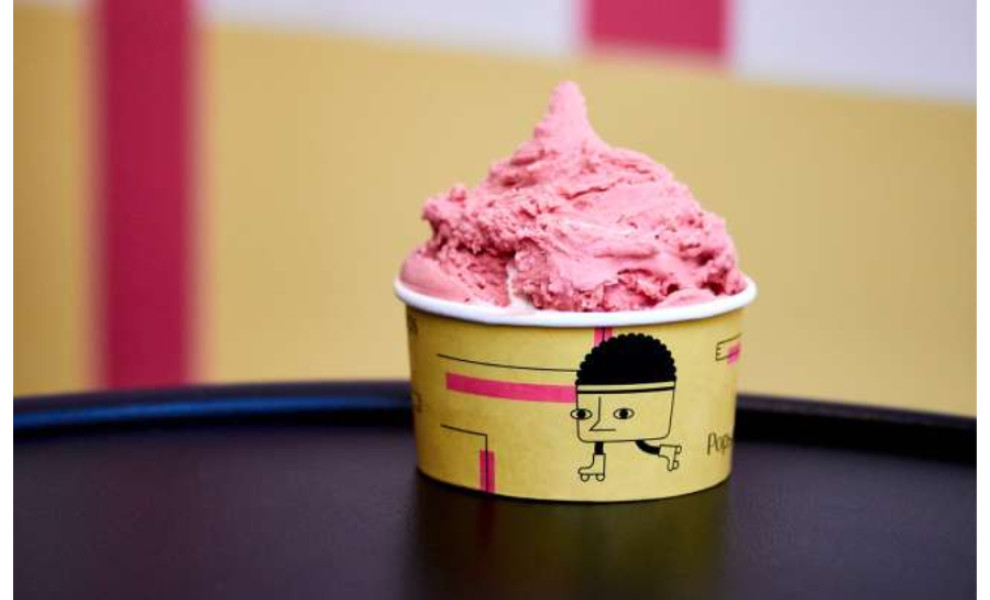
Pops ‘n Bops is an ice cream brand that speaks both to traditionalists and thrill-seekers. With this brand identity, Brandsummit packaged these sweets with the perfect blend of conventional and contemporary styles.
The sweet treats come in two variants. One is the classic Bop, which takes the form of a regular ice cream scoop served in a tub. The other one is the modern and daring Pop, which comes as a popsicle stick.
Using a boxed packaging presentation for the ice cream bundle is also an unusual yet functional way to serve ice cream.
To further highlight the duality, the designers used a fresh and sweet color combination of yellow and pink. This pairing also perfectly represents the pastry character of the brand which is seen in its flavor profile.
The addition of character sketches as illustrations for the packaging is also a great way to personify the brand’s unique identity.
-preview.jpg)

-preview.jpg)