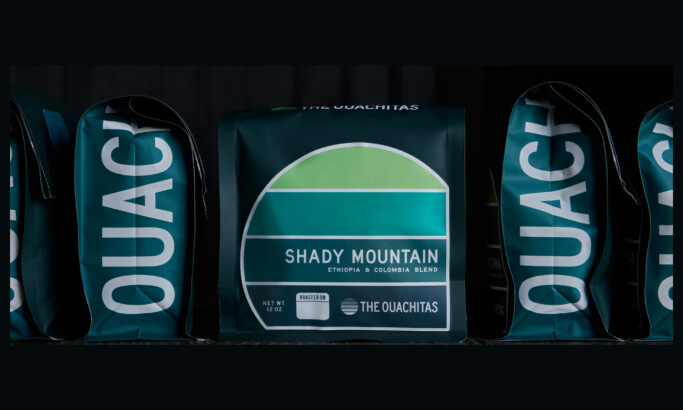
_8093a5266b19-desktop.jpg)
Standout features:
- Heraldry-inspired logo
- Minimalism
- Gold accents
Based on the fruitful slopes of Etna on Sicily and the city of Aprilia in the Lazio region, Scammanca del Murgo family winery has been producing quality wines for more than a century (since 1860). Tasked to enrich their latest cuvée, AD Positive turned to the brand’s rich history to assemble a pristine visual experience for any aesthetically-oriented sommelier.
The wine’s origin story is pivotal to understanding this incredibly minimalistic, yet fantastically eye-pleasing design. Each one flaunts a unique, albeit clean representation of their place of origin. The first one, is the product of the Sicilian Caffarelli vineyard, located just above the ancient tuff quarry, and the second, the pride and joy of La Francescana vineyard, both use their distinct landscape as the main design inspiration for the creation of the labels.
The idiosyncratic packaging tells a rich tale with uncomplicated linework adorned by gold accents. The visual merger of contrasting austerity and opulence, North and South, mirrors Murgo’s blend of traditional viticulture and modern production techniques.