Team Behind the Design
Packaging Design Analysis
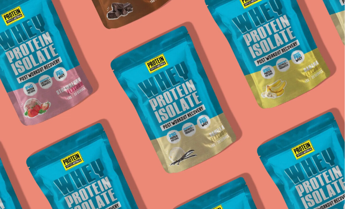
Before evaluating health and wellness packaging designs, I look for clarity, shelf impact, and how well a system scales across flavors.
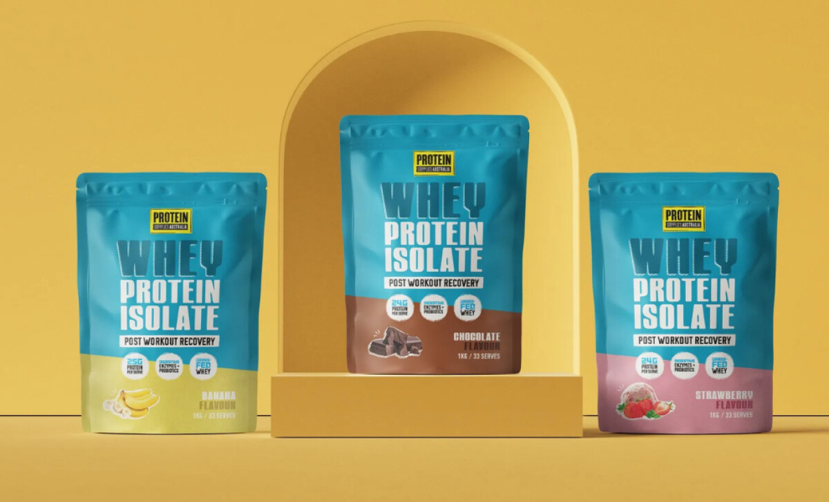
Protein Supplies Australia’s refreshed whey line succeeds through bold visual anchors and thoughtful structure.
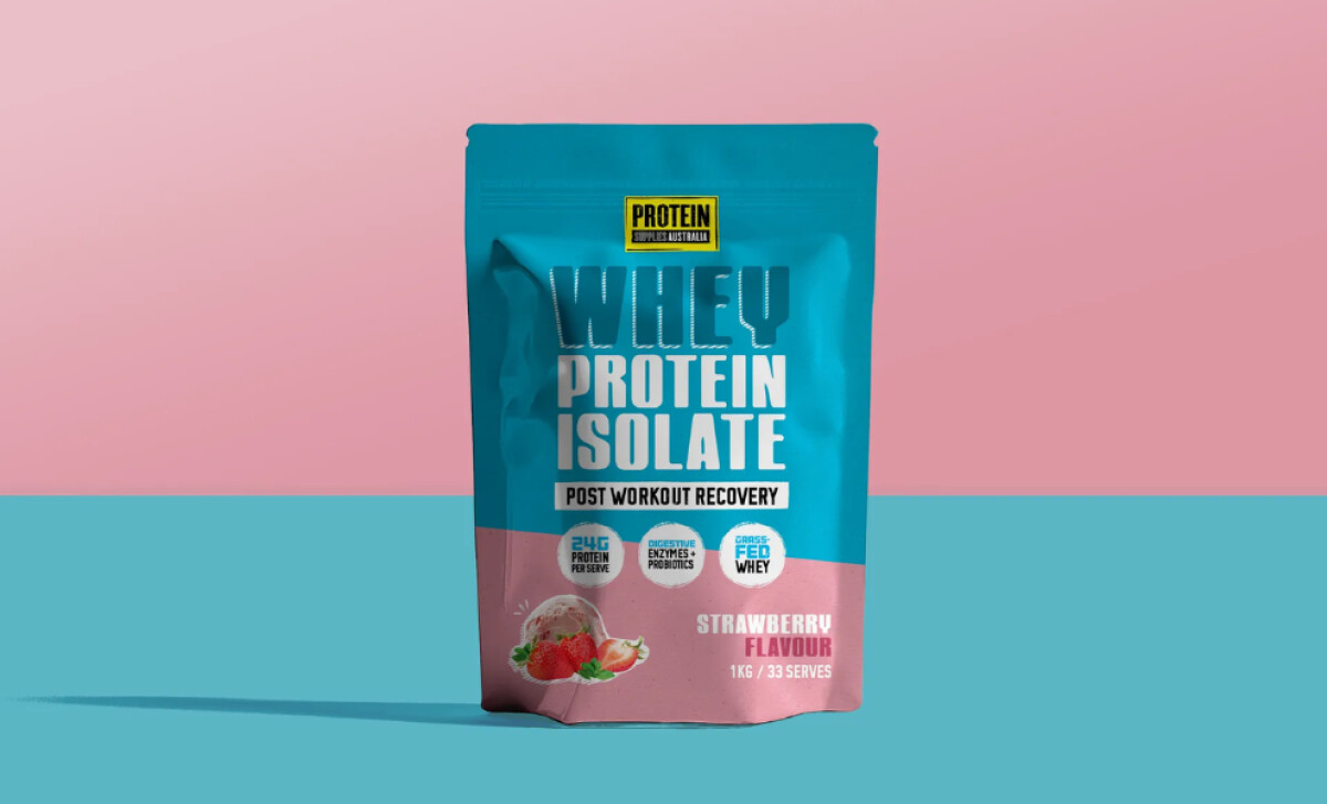
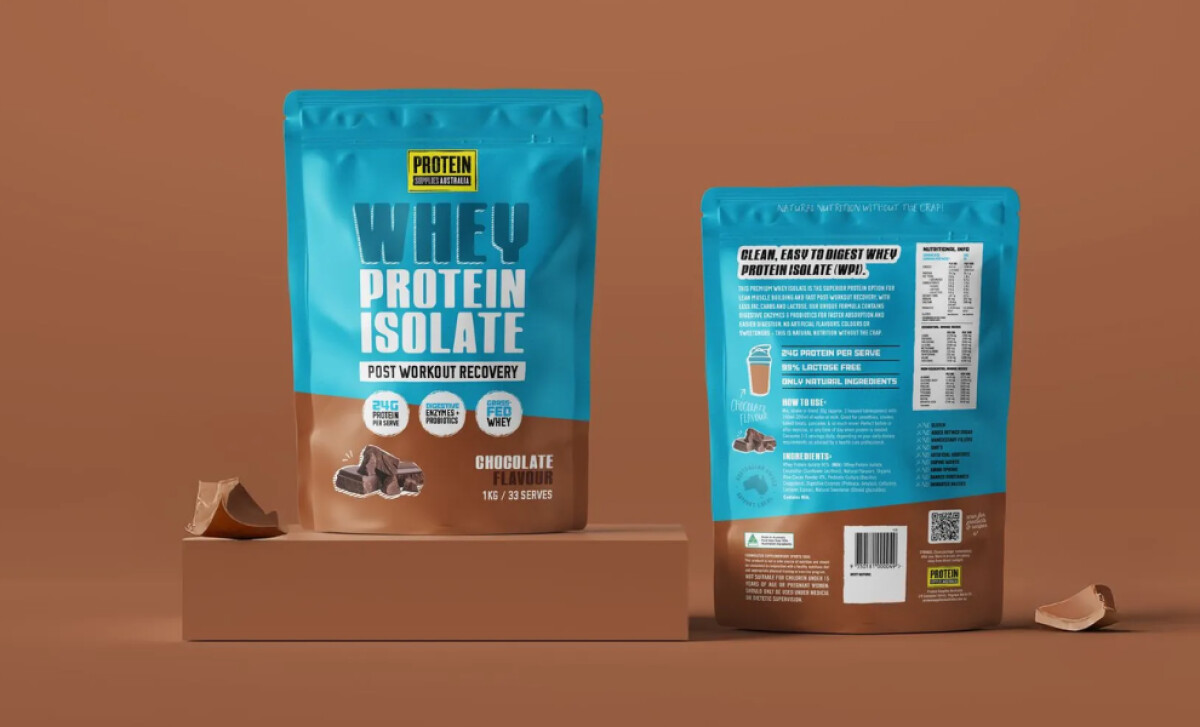
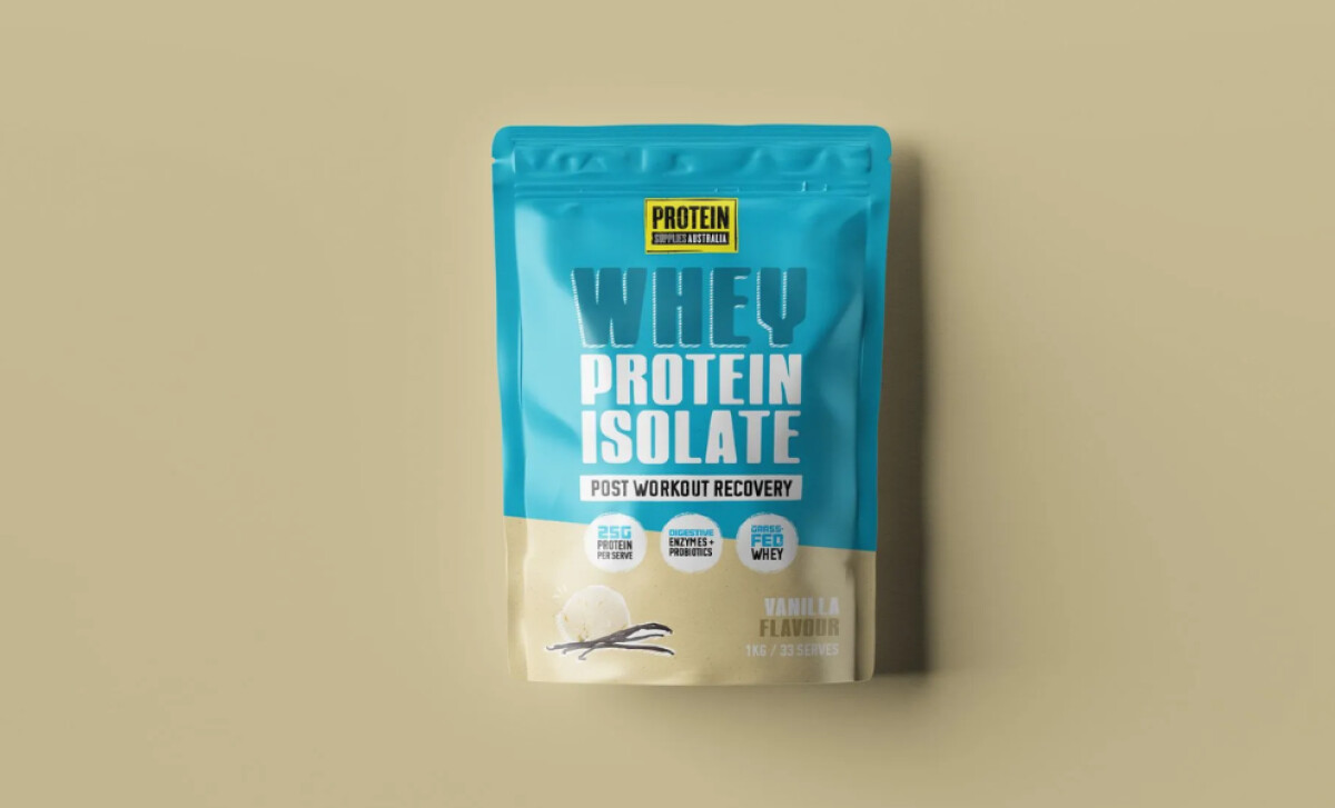
- Color Strategy: The saturated aqua blue across the upper panels creates instant recognition. I appreciate how this single brand color stabilizes the entire range while allowing flavors to stay expressive.
- Typography: The performance-leaning type gives the product real presence. Its blocky, condensed style reads well from a distance, which feels right for a busy retail shelf.
- Flavor Navigation: Separating flavors with angled color zones adds motion and keeps each variant fresh. The palette feels friendly and appetite-aligned, yet still consistent.
- Visual Appetite: The realistic food imagery reassures users about flavor quality. I like how these visuals soften the bold top section and add warmth to the layout.
What Brands & Agencies Can Learn from Protein Supplies Australia
Here are a few lessons from Protein Supplies Australia’s packaging refresh:
1. Anchor Your System Around One Strong Brand Color
A dominant hue like PSA’s aqua builds instant recognition and reduces visual noise across large product lines.
2. Use Typography to Communicate Functional Confidence
Performance-driven categories benefit from bold, readable type that signals authority without feeling corporate.
3. Improve User Experience Through Flavor-Based Structure
Clear color blocking and consistent flavor cues help customers make quick decisions — especially in crowded retail settings.
About DesignRush Featured Designs
At DesignRush, we review hundreds of agency projects each month. The featured designs stand out for creativity, relevance, and execution.
Many go on to be recognized as winners of our Monthly Design Awards.
Explore more creative work here:
- Best Packaging Designs
- Best Website Designs
- Best App Designs
- Best Logo Designs
- Best Print Designs
- Best Video Designs
For a full list of design agencies and related services, see our Agency Directory.


